4 Single-cell RNA-sequencing
Cluster, differential expression, cell-typing, and trajectory analysis
Personal opinion: Most methods for single-cell RNA-sequencing “generalize” to other modalities
Most of the statistical logic discussed for scRNA-seq will work for any other sequencing technology, even if it’s for another omic. While the literal details might change (and might be repackaged as a different method), this high-level statistical logic has stood the test of time, at least over the 10+ years. This is why it is arguably more important to understand the reason why certain methods are used, compared to how the method works.
4.1 Some important nouns and verbs
Sequencing (verb): The process of determining the order of nucleotides (A, T, C, G) in a DNA or RNA molecule, providing the primary structure of these biomolecules. Sequencing technologies have evolved to be high-throughput, enabling the analysis of entire genomes or transcriptomes.
Sequencing depth, read depth, library size (noun; all synonyms): These terms refer to the number of times a specific nucleotide or region of the genome is sequenced in an experiment. Greater depth provides more accurate detection of rare variants or lowly expressed genes but requires increased computational and financial resources.
Chromosome, DNA, RNA, protein (noun):
- Chromosome: A large, organized structure of DNA and associated proteins that contains many genes and regulatory elements.
- DNA: The molecule that encodes genetic information in a double-helical structure.
- RNA: A single-stranded molecule transcribed from DNA that can act as a messenger (mRNA), a structural component (rRNA), or a regulator (e.g., miRNA). When we talk about scRNA-seq, we are usually referring to exclusively measuring mRNA.
- Protein: The functional biomolecule synthesized from RNA via translation, performing structural, enzymatic, and regulatory roles in cells.
- Chromosome: A large, organized structure of DNA and associated proteins that contains many genes and regulatory elements.
Genome vs. gene vs. intergenic region (noun):
- Genome: The complete set of DNA in an organism, encompassing all of its genetic material, including coding genes, non-coding regions, and regulatory elements. The genome is the blueprint that defines the biological potential of the organism.
- Gene: A specific sequence within the genome that encodes a functional product, typically a protein or functional RNA. Genes include regions such as exons (coding sequences), introns (non-coding regions within a gene), and regulatory sequences (e.g., promoters and enhancers) that control gene expression. We will see more about the architecture of a gene in Section 7.1.
- Intergenic region: The stretches of DNA between genes that do not directly code for proteins or RNA. Intergenic regions were once considered “junk DNA,” but they often contain regulatory elements, such as enhancers and silencers, that influence the expression of nearby or distant genes. These regions also play roles in chromatin organization and genome stability.
- Genome: The complete set of DNA in an organism, encompassing all of its genetic material, including coding genes, non-coding regions, and regulatory elements. The genome is the blueprint that defines the biological potential of the organism.
Genetics vs. genomics (noun): Genetics typically focuses on the role of the DNA among large populations (of people, of species, etc.), while genomics can encapsulate any omic, and does not necessarily imply studies across a large population1.
“Next generation sequencing” (noun)2: A collection of high-throughput technologies that allow for the parallel sequencing of millions of DNA or RNA molecules. It has revolutionized biology by enabling large-scale studies of genomes, transcriptomes, and epigenomes.
Read fragment (noun): A short sequence of DNA or RNA produced as an output from high-throughput sequencing. Fragments are typically between 50 bp and 300 bp long, depending on the sequencing technology, and they represent segments of the original molecule being sequenced.
Reference genome (noun): A curated, complete assembly of the genomic sequence for a species, used as a template to align and interpret sequencing reads. It serves as a baseline for identifying genetic variations, such as mutations or structural changes, and for annotating functional elements.
Coding genes vs. non-coding genes (noun):
- Coding genes: Genes that contain instructions for producing proteins. They are transcribed into mRNA, which is then translated into functional proteins that perform structural, enzymatic, or regulatory roles in cells.
- Non-coding genes: Genes that do not produce proteins but instead generate functional RNA molecules, such as rRNA, tRNA, miRNA, or lncRNA, which regulate gene expression, maintain genomic stability, or perform other cellular functions. Non-coding genes highlight the complexity of gene regulation and cellular processes beyond protein synthesis.
- Coding genes: Genes that contain instructions for producing proteins. They are transcribed into mRNA, which is then translated into functional proteins that perform structural, enzymatic, or regulatory roles in cells.
Epigenetics vs. epigenomics (noun): Epigenetics studies modifications to DNA and histones (e.g., methylation, acetylation) that regulate gene expression without altering the DNA sequence. Epigenomics examines these modifications across the entire genome.
Transcriptome (noun): The complete set of RNA transcripts expressed in a cell or tissue at a given time, reflecting dynamic gene activity.
Proteome (noun): The full complement of proteins expressed in a cell, tissue, or organism, representing functional output.
Single-cell sequencing (noun): Sequencing technologies applied at the resolution of individual cells, allowing for the study of heterogeneity in gene expression, epigenetics, or genetic variation across cell populations.
Bulk sequencing (noun): Sequencing technologies that aggregate material (e.g., RNA, DNA) from many cells, providing an average profile of the population but masking individual cell variability.
4.2 How scRNA-seq works as a technology
Remark (Single-cell vs. single-nuclei). While I use the word “cell,” sometimes in certain biological tissues, the more accurate word is “nuclei.” The computational methods for single-cell RNA-seq data (scRNA-seq) is essentially the same as single-nuclei RNA-seq data (snRNA-seq). What’s different is the biological context. For instance, some biological processes happen only in the nucleus, so when you collect snRNA-seq data, you might be overly enriched to discover those processes. See (Denisenko et al. 2020; Ding et al. 2020) for example.
See Figure 4.1 for an illustration of how the 10x protocol works. We’ll explain this next (and more importantly, why it’s important for a statistician to know how single-cell sequencing works)3.
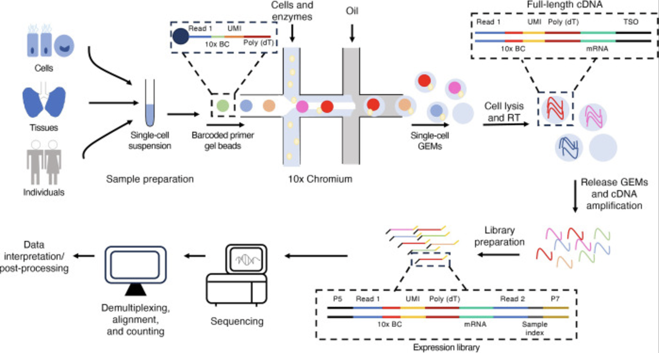
- Tissue dissociation and cell isolation: The tissue of interest is dissociated into a suspension of individual cells using enzymatic or mechanical methods. Single cells are isolated, often using fluorescence-activated cell sorting (FACS) or microfluidic techniques. This step is why some biological systems require “single-nuclei” instead of “single-cell.”
Remark (Tissue dissociation is typically invasive). The main non-invasive ways is through blood, skin, and urine/feces. Otherwise, unlike MRIs, this is not easy to access tissues in humans. Hence, human samples from most non-accessible biological systems (i.e., brain, lung, heart, etc.) are usually obtain with prior consent from donors after surgery, biopsy, transplant, etc.
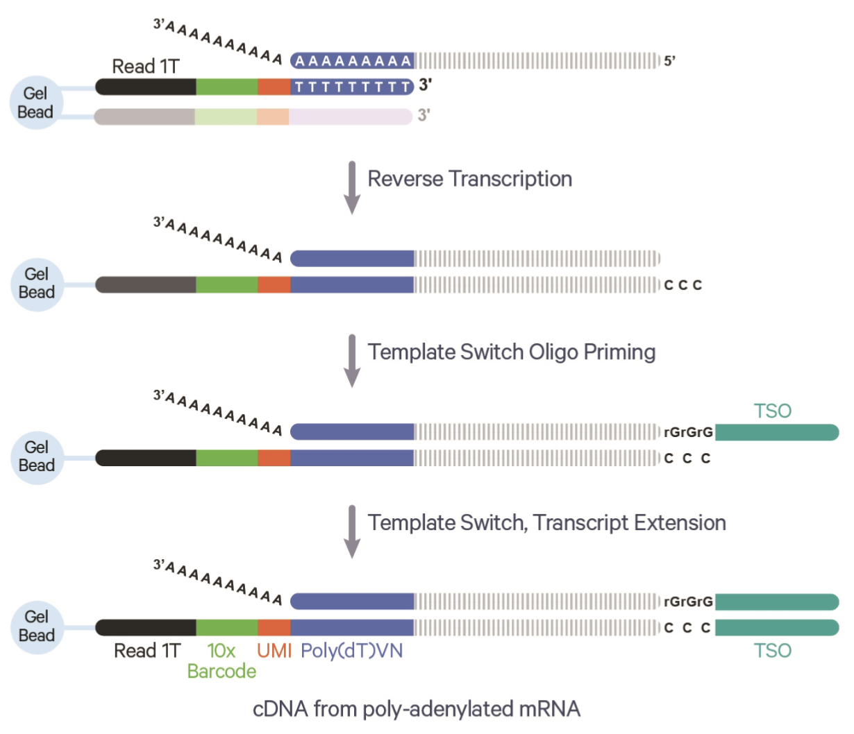
Droplet formation: Cells are encapsulated into tiny droplets along with barcoded beads. Each bead contains unique molecular identifiers (UMIs) and cell-specific barcodes to label RNA molecules from individual cells. This step is the how we can keep track and eventually figure out which data came from which cell.4
Cell lysis and RNA capture: Cells are lysed within the droplets, and the released RNA molecules hybridize to oligonucleotides on the barcoded beads. This step ensures that all RNA from a single cell is tagged with the same cell-specific barcode.
Remark (Lysing prevents longitudinal profile). This step is why, by default, scRNA-seq cannot do longitudinal experiments on literally the same cells. You have to destroy the cell to sequence it.
- Reverse transcription, cDNA synthesis, and PCR amplification: The captured RNA is reverse-transcribed into complementary DNA (cDNA), incorporating the barcodes and UMIs to track the origin of each molecule. The cDNA is amplified via PCR to generate enough material for sequencing5. UMIs help correct for amplification biases by identifying and collapsing duplicate reads from the same original RNA molecule. See Figure 4.2 for the benefit the UMI.
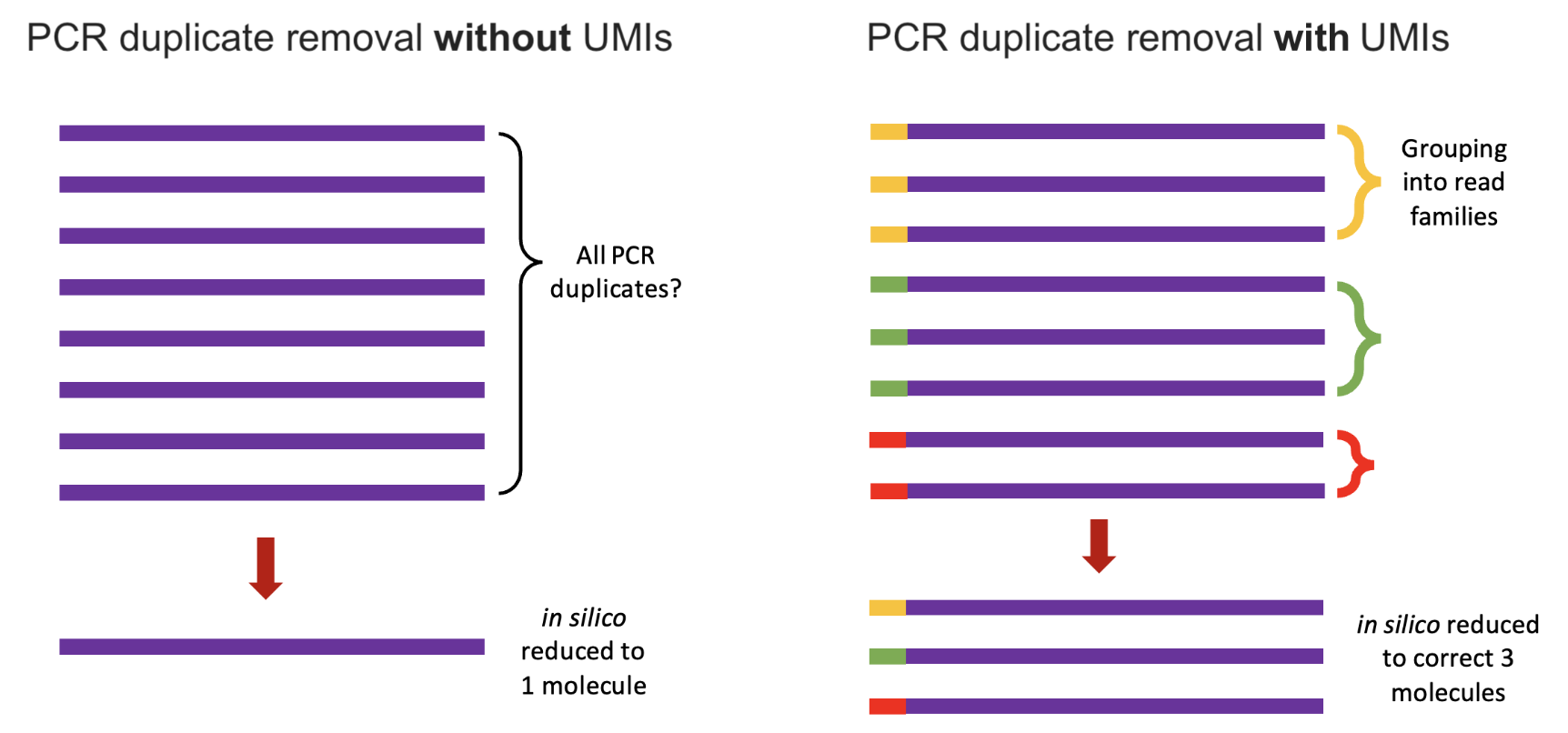
Remark (The importance and impact of PCR). Some biological modalities cannot be PCR’d reliably. This is why (as we’ll see later in the course) certain omics are a lot harder to get data of at single-cell resolution. The PCR step is important because you can imagine it’s very hard to sequence every fragment in a cell. There might be many fragments, but you won’t be able to sequence many of them. By amplifying the content in a cell, we can more reliably sequence the contents in that cell. The UMIs become very important because we want to make sure our eventual gene expression counts are the fragments from the original cell, not counts due to PCR amplification.
- Library preparation and high-throughput sequencing: Amplified cDNA is fragmented (if necessary) and adapters are added to prepare the material for sequencing. These adapters are required for sequencing compatibility and indexing. The prepared library is sequenced on a next-generation sequencing platform6, generating short reads7 that include both the transcript sequence and the associated barcodes and UMIs
Remark (The impact of “short reads”). Short reads, typically around 50-400 base pairs long8, are the output of most high-throughput sequencing platforms (i.e., a limitation of using Illumina sequencing, for example). While they provide highly accurate and cost-effective data, their limited length can pose challenges in resolving complex regions of the genome, such as repetitive sequences, or distinguishing between transcript isoforms in RNA-seq data. These limitations can obscure biological insights, particularly in applications requiring full-length transcript information or precise structural variation analysis.
Remark (Limitation of budget). The sequencing step is a costly step (in terms of money) in a data generation process. The more money you spend, the more sequencing depth you can get. (Of course, this is also dictated by the number of cells in your experiment, the cell quality, the efficacy of the sequencing protocol, etc.) However, if you don’t sequence using a large financial budget, then your count matrix \(X\) will have even more 0’s. This means you have less “resolution” to discover biological insights9.
- Mapping and alignment: Sequencing reads are mapped to a reference genome or transcriptome to identify the originating genes. UMIs are used to remove PCR duplicates, ensuring accurate quantification of transcripts. This is a classic bioinformatics task – given a sequencing fragment (i.e., the literal basepair sequence) and a reference genome, figure out where in the reference genome this sequencing fragment should map to. If you are doing a typical 10x scRNA-seq experiment, the software to do this (made by 10x) is called CellRanger10.
Remark 4.1. Remark (A lot of fascinating biology is thrown out). During the mapping and alignment step, many sequencing reads are often discarded because they do not align to the reference genome or transcriptome used in the analysis. This includes reads from bacteria and viruses, which could reveal insights into host-microbe interactions or infections (Arabi et al. 2023; Sato et al. 2018). Similarly, long non-coding RNAs (lncRNAs) (Mattick et al. 2023), genetic variation (including allele-specific expression) (Robles-Espinoza et al. 2021), alternative splicing (J. Chen and Weiss 2015), and untranslated regions (UTRs) of mRNAs are frequently overlooked in standard analyses despite their crucial roles in gene regulation, transcript stability, and translation (Arora et al. 2022). While these regions and features are often excluded for simplicity or due to lack of annotation, they represent a wealth of biological information that could lead to fascinating discoveries if properly explored.
Remark 4.2. Remark (Why zero-inflation is not currently as popular for scRNA-seq analyses). As I mentioned in Section 3.3.13, modeling zero-inflation is not very common anymore. (This is also why we typically do not use an imputation step beyond the usual dimension reduction.) This was shown for droplet-based sequencing protocols (Svensson 2020), alongside its replies and responses (Cao et al. 2021; Svensson 2021). You might also be interested as well to read more about where the 0’s in a count matrix could come from during the entire sequencing protocol (Jiang et al. 2022), and how UMIs have contributed to not needing to worry about zero-inflation as much anymore (W. Chen et al. 2018; Kim, Zhou, and Chen 2020).
4.3 Clustering
Input/Output.
The input to clustering is a normalized matrix \(X\in \mathbb{R}^{n\times p}\) for \(n\) cells and \(p\) features (i.e., genes) and typically a clustering resolution, and the output is a partitioning of all the cells. That is, if there are estimated to be \(K\) clusters, each cell is assigned to one of the \(K\) clusters.
4.3.1 What is a “cell type”? No, seriously. What is it?
The concept of a “cell type” is foundational yet complex in biology. Historically, cell types have been defined by shared structural and functional characteristics, making them distinct from other cells in an organism. However, this simplicity belies a deeper challenge: what features truly define a cell type? Modern research has shown that cell types exhibit diverse properties across molecular (i.e., the mRNA fragments and proteins in the cell), morphological (i.e., the shape of the cell), spatial (i.e., where the cell is in the human body), ancestry (i.e., where the cell originated from), and functional (i.e., the purpose of this cell) dimensions, often making it difficult to draw clear boundaries. For example:
- Example of obvious distinctions: Obvious differences in cells are often rooted in their structure and function. Heart muscle cells contract using striated fibers, while neurons transmit signals via dendrites and axons, making their structures and functions unmistakably distinct.
- Example of not-obvious distinctions: Neurons in the brain have been categorized based on their shape, connectivity, and gene expression patterns, but these dimensions do not always align, leading to ambiguities in classification.
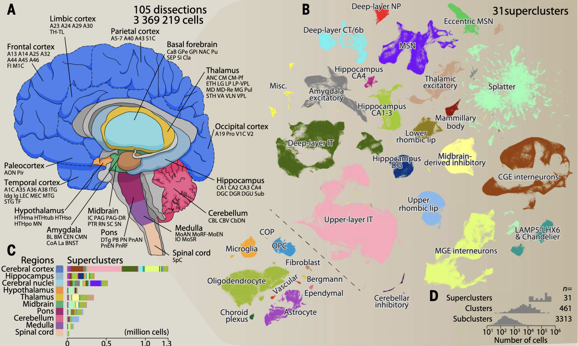
For example, in many “atlas” projects (i.e., big scientific collaborators that aim to exhaustively profile many cells to understand the full diversity of cells), there is a very fundamental question: “How many cell types are there?” This is illustrated in Figure 4.411, where after exhaustively profile 4 brains from multiple brain regions, the authors defined 31 “superclusters” (shown as different colors) that separate into 3313 “subclusters.”
Advances in single-cell transcriptomics have revolutionized how we define cell types. By profiling thousands of genes simultaneously, researchers can cluster cells into groups based on gene expression patterns, creating detailed cell taxonomies. Yet, even this high-resolution approach raises questions about granularity—should closely related clusters represent distinct cell types or variations within the same type? Additionally, transcriptomic definitions often need validation through other modalities, such as spatial organization, connectivity, or functional roles. See Figure 4.5 for illustrations of other biotechnology assays to define cell types. Despite these challenges, integrating these diverse perspectives is essential for understanding how cells contribute to the structure and function of tissues and organs in both health and disease.
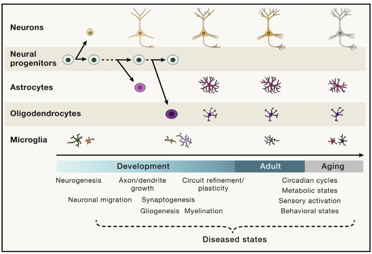
Remark (Personal opinion: Being stunlocked on how to define “cell type” in your paper is the rite of passage to becoming a cell biologist). The more you work closer to biology, the more you’ll realize that answering “What is a cell type?” transforms from a seemingly useless pedagogical question into insanely difficult question that requires you to dig deep into biology. For instance, aging research is currently at the forefront of a lot of biomedical research. However, consider Figure 4.6. Does a cell switch it’s “cell type” as we age? (Clearly, the answer must be “yes” to some degree, since all our cells originate from an embryo.) However, when we age from 70 to 80 years old, do our cells change their “cell type” as certain cells start losing their intended function?
The questions can get even crazier: Suppose I “discover a new cell type” in my high-profile scRNA-seq analysis. What does that mean? How do I convey to another researcher what defines this cell type? How am I confident that this “cell type” can be found in donors not in my dataset? (Our notation of cell type would be quite useless if it only existed in one donor or one dataset.)
We will focus on how to cluster cells in the remainder of this section, but we’ll discuss how to label the clusters as “cell types” in Section 4.6, and how to infer temporal relations in Section 4.7.
4.3.2 Clustering cells into cell types or cell states
Clustering is a central step in single-cell RNA-sequencing analysis, allowing researchers to group cells with similar gene expression profiles into distinct clusters that represent cell types or states. Methods like Louvain or Leiden clustering are commonly used for this purpose, leveraging the low-dimensional representation from Principal Component Analysis (PCA) to identify patterns of cellular heterogeneity. These algorithms operate on a graph-based representation of the data, where cells are nodes and edges reflect similarities in their PCA embeddings. The goal is to partition cells into cohesive groups that capture biologically meaningful variation, such as distinct immune cell types or developmental stages. By clustering cells, researchers can uncover the diversity within a tissue or system and generate hypotheses about the roles of different cell populations in health and disease.
4.3.3 The standard procedure: Louvain clustering
Louvain clustering is a graph-based community detection algorithm widely used in single-cell RNA-seq (scRNA-seq) analysis to group cells into clusters representing cell types or states. The algorithm operates on a nearest-neighbor graph constructed from the low-dimensional representation of the data, such as the first few principal components obtained via Principal Component Analysis (PCA). This methods needs one tuning parameter \(\gamma\), which denotes the “resolution” of the method.
- Initialization (Graph construction): The first step in Louvain clustering is to construct a graph \(G = (V, E)\), where:
- \(V\) represents the set of nodes (cells),
- \(E\) represents the edges between nodes, with weights \(w_{ij}\) quantifying the similarity between cells \(i\) and \(j\).
The edge weights \(w_{ij}\) are typically computed using a similarity metric, such as Euclidean distance or cosine similarity, and thresholded to retain only the \(k\)-nearest neighbors for each node.
- The objective (Modularity optimization): The goal of Louvain clustering is to maximize the modularity \(Q\) of the graph, defined as: \[ Q = \frac{1}{2m} \sum_{i,j} \left( w_{ij} - \gamma \frac{k_i k_j}{2m} \right) \delta(c_i, c_j), \] where:
- \(w_{ij}\) is the weight of the edge between nodes \(i\) and \(j\),
- \(\gamma\) is the resolution of the desired clustering (a larger number means smaller cluster sizes),
- \(k_i = \sum_j w_{ij}\) is the sum of edge weights for node \(i\),
- \(m = \frac{1}{2} \sum_{i,j} w_{ij}\) is the total weight of all edges in the graph,
- \(c_i\) is the community assignment for node \(i\),
- \(\delta(c_i, c_j)\) is an indicator function that equals 1 if nodes \(i\) and \(j\) belong to the same community, and 0 otherwise.
The modularity measures the quality of a partition by comparing the observed edge weights within communities to those expected under a random graph with the same degree distribution. (Conceptually, you can see that \(k_i k_j/(2m)\) represents the expected edge weight under a random graph model – a sort of “background distribution” adjustment.)
- The estimation procedure (Iterative refinement): Louvain clustering proceeds iteratively:
- Each node is initially assigned to its own community.
- Nodes are moved to neighboring communities if this increases the modularity \(Q\).
- Communities are aggregated into “super-nodes,” and the process repeats on the coarsened graph.
The algorithm terminates when no further modularity improvement is possible.
In the context of scRNA-seq, Louvain clustering is applied to the nearest-neighbor graph of cells constructed from their PCA embeddings. The resulting clusters correspond to groups of cells with similar gene expression profiles, often representing distinct cell types or states. This method is computationally efficient and well-suited for the large, sparse graphs typical of scRNA-seq data. Louvain clustering’s modularity-based approach provides a flexible framework for uncovering cellular heterogeneity, making it a cornerstone of single-cell analysis pipelines.
Remark (Leiden as an improvement over Louvain). The Leiden algorithm (Traag, Waltman, and Van Eck 2019) improves upon Louvain by addressing issues of cluster quality and stability. While Louvain can produce disconnected or poorly connected clusters, Leiden guarantees that clusters are well-connected and more robust. This makes Leiden particularly suitable for high-dimensional and noisy datasets, such as those in single-cell RNA-seq analyses.
Remark (You specify a resolution, not the number of clusters). In many clustering algorithms, particularly graph-based methods like Louvain or Leiden, you specify a resolution parameter that influences the granularity of the clustering. A higher resolution typically results in more, smaller clusters, while a lower resolution produces fewer, larger clusters. The number of clusters is not fixed beforehand but emerges as a result of the resolution and the underlying structure of the data.
4.3.4 How to do this in practice
See the Seurat::FindClusters function, illustrated in Figure 4.7. The resulting visualization is shown in Figure 4.8.
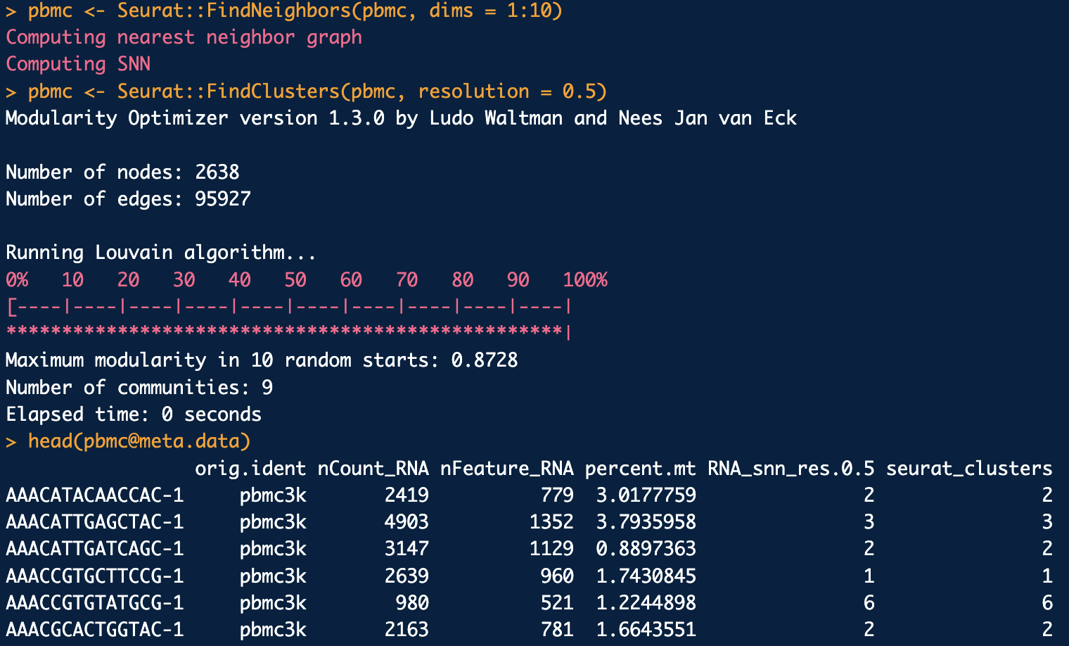
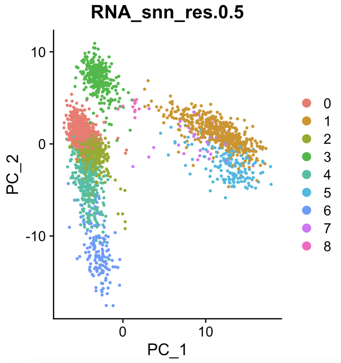
Seurat::DimPlot(pbmc, reduction = "pca", group.by = "RNA_snn_res.0.5") (left) function to visualize the clusters.
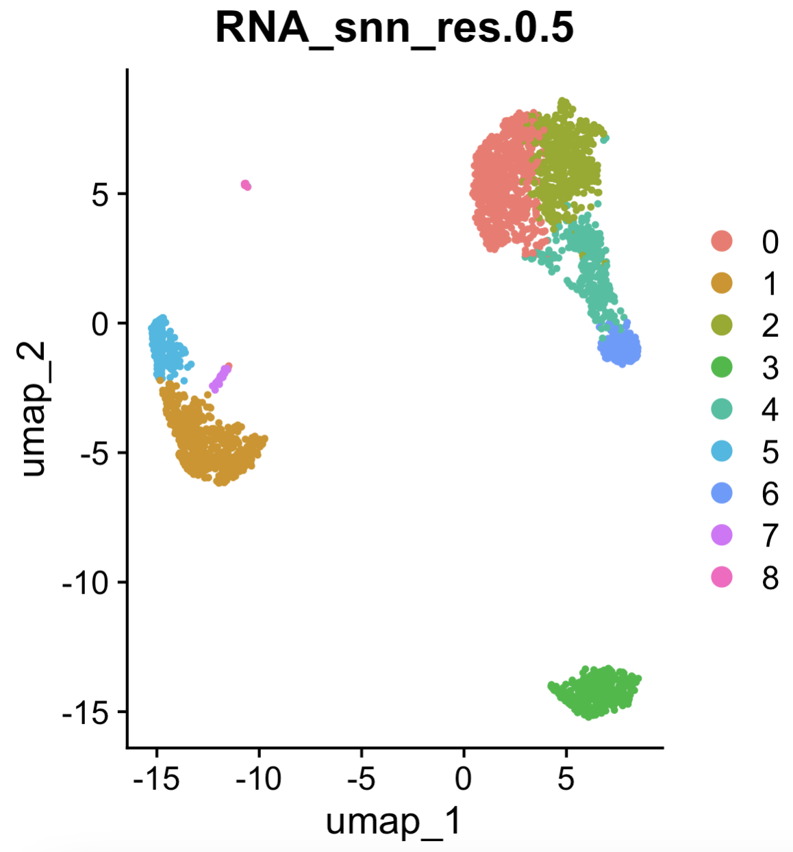
Seurat::DimPlot(pbmc, reduction = "umap", group.by = "RNA_snn_res.0.5") (right) function to visualize the clusters. See the tutorial in https://satijalab.org/seurat/articles/pbmc3k_tutorial.html.
Remark 4.3. Remark (Clustering is often an exploratory step, which then allows you focus on key populations of interest later on in your research project). As you can see here, the clustering role (together with the previous visualization steps and the cell-type labeling to be discussed in Section 4.6) is to provide you a high-level overview of what your dataset contains. After all, when you get a scRNA-seq data fresh out of a wetlab experiment, you don’t actually know what kind of cells are in your dataset. (No dataset comes automatically labeled with cell types.)
Usually in your paper, after determining the clusters (and their cell types), you will spend a considerable portion of the paper going in-depth on just a few key cell types.
Remark (Personal opinion: Make a bit too many clusters, and manually adjust/merge). Starting with a higher number of clusters can capture finer granularity and prevent important subpopulations from being overlooked. You can then manually combine clusters based on biological knowledge or other criteria, ensuring the final groupings are both meaningful and interpretable.
While this might seem sacrilegious to statistical hard-liners, the reality of scRNA-seq analyses is that: 1) you don’t want technical artifacts (from sequencing) or numerical quirks (based on the literal computational method being used) to dictate certain cell clusters (sometimes certain clusters are way too small to be meaningful), and 2) for the reality mentioned in Remark 4.3, it might not be great use to time to worry about the “perfect clustering straight out of a method.” As long as you can justify your actions biologically, you’ll be in good hands.
Remark (Personal opinion: If you’re goal is to make an atlas, consider hierarchical clustering methods). Recall Figure 4.5. If the goal of your project is to delineate all the different types of biological variation in your dataset, you’re probably better off using a method that gives you a hierarchy of cell clusters (rather than one fixed clustering). Methods like PAGA (Wolf et al. 2019) and MRTree (Peng et al. 2021) are some (among many) that are useful for this exact task.
4.3.5 A brief note on other approaches
See (S. Zhang et al. 2020; Yu et al. 2022) on benchmarking of various ways to cluster cells.
4.3.6 Clustering cells into “meta-cells”
Clustering cells into “meta-cells” is a strategy primarily aimed at simplifying the analysis of single-cell data or increasing the robustness of downstream analyses. In this approach, individual cells are grouped into larger aggregates, or meta-cells, based on their similarity in gene expression profiles. Unlike clustering aimed at identifying biologically meaningful cell types or states, meta-cells are often created to reduce noise, handle sparsity, or improve computational efficiency by working with fewer, more aggregated units. By combining the counts of multiple cells into a single meta-cell, this technique can also mitigate technical variability, making patterns in the data easier to detect. While meta-cells may not represent distinct biological entities, they serve as a practical tool for gaining insights from large and noisy datasets.
4.3.7 How to do this in practice
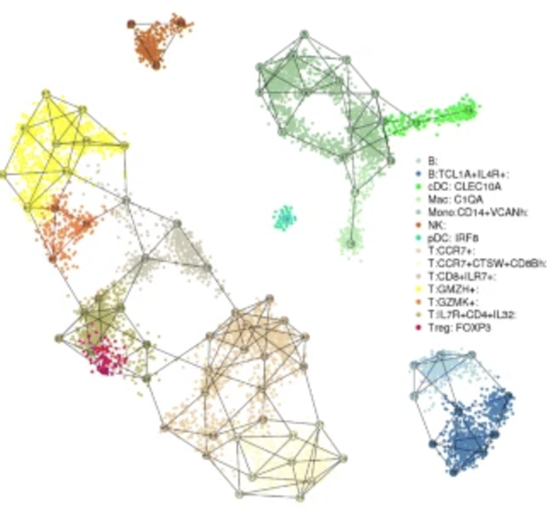
The method I’ve seen most commonly used for this task is MetaCell (Baran et al. 2019). These metacells are constructed using a graph-based partitioning method that leverages k-nearest neighbor (K-nn) similarity graphs to identify groups of cells with highly similar gene expression profiles. By grouping cells into metacells, the method effectively reduces noise while preserving meaningful biological variance, allowing for robust and unbiased exploration of transcriptional states, gradients, and cell types. This is illustrated in Figure 4.10.
4.3.8 A brief note on other approaches
See a review in (Bilous et al. 2024).
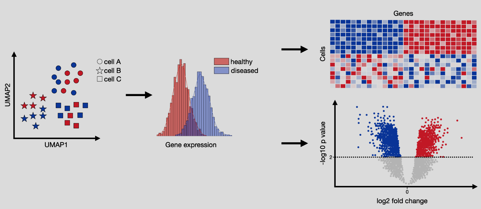
4.4 Differential expression
Differential expression (DE) analysis, illustrated in Figure 4.12, aims to identify genes that are expressed at significantly different levels between two groups of cells. We will discuss two primary scenarios in the following section: 1) either where the groups are estimated from data, or 2) where the groups are determined by the experimental design. This comparison helps uncover genes that may play critical roles in the biological processes or phenotypic changes under investigation. In the context of single-cell RNA-seq, DE analysis must account for the unique challenges of sparsity and variability in the data. The primary goal is to highlight key molecular drivers of the experimental conditions, providing insights into underlying mechanisms or potential targets for therapeutic intervention. This analysis is foundational for linking cellular behavior to experimental manipulations or disease states.
See https://www.sc-best-practices.org/conditions/differential_gene_expression.html for more background.
Input/Output. The input to differential expression is matrix \(X\in \mathbb{R}^{n\times p}\) for \(n\) cells and \(p\) features (i.e., genes) split into two groups, and the output is two numbers per gene. One is the p-value for the gene (denoting how significant that gene deviates from the null distribution where there is no difference in the gene expression between the two groups. A smaller p-value denotes more evidence against the null), and the other is log fold change (denoting, roughly, how much larger the mean expression in one group is larger than the mean expression of the other group). The p-value is a number between \(0\) and \(1\), and the log-fold change is any real value where both the sign and magnitude are important.
Remark (Intent of Differential Expression Analysis). The primary intent of differential expression (DE) analysis in single-cell RNA-seq is not usually to provide definitive evidence for interventions, such as proving a drug’s efficacy. Instead, DE in single-cell studies is often exploratory, aimed at uncovering basic biological insights. It addresses questions like, “We know there is a difference between these two conditions, but what is driving that difference at the cellular level?” The goal is to identify genes that exhibit meaningful changes in expression, contributing to our collective understanding of gene functions and their roles in cellular processes. These findings expand the compendium of knowledge that informs future experiments and hypotheses.
Remark (Pleiotropy and the Need for Continued DE Analyses). There are a ton of existing databases that document what the function of each gene is. For instance, you can see collections of genes (https://www.genome.jp/kegg/kegg2.html and https://www.gsea-msigdb.org/gsea/msigdb) or individual genes (https://www.ncbi.nlm.nih.gov/gene and https://www.genecards.org/). You might wonder – given this wealth of knowledge, why bother do any more DE analyses on your own?
Pleiotropy, where a single gene influences multiple, seemingly unrelated biological processes, underscores the importance of continued differential expression (DE) analyses even in the presence of well-annotated pathways like KEGG. While these resources provide invaluable insights into known gene functions and pathways, they often fail to capture the full complexity of gene roles across diverse cellular contexts, conditions, or tissues. DE analysis allows us to uncover novel functions or unexpected roles for genes, especially in underexplored biological systems or conditions. Pleiotropic effects are context-dependent, and without systematically exploring gene expression across varied conditions, we risk oversimplifying or missing critical aspects of cellular and molecular biology.
4.4.1 Hold on… isn’t DE just a t-test?
So why is DE even an interesting problem? Couldn’t we just use a t-test (parametric, asymptotic), Wilcoxon rank-sum test (nonparametric, asymptotic), or permutation test (nonparametric, exact)? Yes, you can.
So why is there a huge field studying DE in genomics, and why are there so many methods? Ultimately, the focus is on achieving greater statistical power or applying the methods more broadly across diverse datasets and experimental conditions. It boils down to engineering the underlying statistical model to do the following two things effectively:
- Extract the “meaningful” signal: While we could run any of the aforementioned tests on the observed single-cell data, the results might be misleading due to the presence of unwanted covariates. For example, significant genes might simply reflect technical artifacts, such as the correlation between gene expression and the number of cells with non-zero counts for that gene.
As we’ve discussed, these are cases where technical noise (i.e., noise induced by the measurement or sequencing process, and theoretically removable with perfect technology) has not been properly accounted for. The challenge, then, is to design a statistical model that “removes” this noise, isolating the “meaningful” biological signal. Without this step, DE results may reflect experimental artifacts rather than true biological differences.
- Sharing information across genes to increase power, while controlling Type-1 error: Single-cell data is often much sparser than bulk sequencing data, leading to fewer detectable signals. This raises the question: can we pool information across genes to enhance the statistical power of our tests? For example, one might consider smoothing the expression matrix to reduce noise.
(Recall that 70%+ of a single-cell dataset is 0’s. This means you should expect little power by default. Hence, different DE methods deploy different strategies to improve the power as much as possible.)
However, pooling or smoothing introduces a delicate tradeoff. While it can increase power by borrowing strength from other genes, it risks inflating false positives if overdone. If the smoothing is too aggressive, what might have been a single DE gene could appear as a broader, artificial signal across multiple genes. Designing models that balance this tradeoff, while maintaining statistical validity, is a key challenge in single-cell DE analyses.
Hence, DE can be approached with classical tests, the nuances of single-cell data – ranging from technical noise to sparse data and confounding factors – necessitate specialized models and methods. The ultimate goal is to extract biologically meaningful insights while ensuring robust statistical inference.
4.4.2 DE between two data-driven grouping of cells
Performing differential expression (DE) analysis between two data-driven groupings of cells, such as clusters identified during analysis, poses unique statistical challenges. A key issue is circularity: the same genes used to define the cell clusters may bias the DE results, complicating the interpretation of identified marker genes. This lack of statistical independence can undermine the validity of formal inference. However, despite these limitations, this type of DE analysis holds substantial exploratory value. It provides a practical way to highlight key genes that distinguish cell types or states. These genes are often called marker genes. The marker genes identified in this manner can still serve as useful entry points for understanding the biological roles of different cell groups, even if their statistical rigor is limited.
4.4.3 Wilcoxon Rank-Sum Test for Differential Expression Testing
The Wilcoxon rank-sum test is a non-parametric statistical test used to assess whether the distributions of a gene’s expression values differ significantly between two groups of cells. It is particularly well-suited for single-cell RNA-seq data that has been normalized, as it does not assume the data follows a specific distribution, such as normality. The test is based on the ranks of the data rather than the raw expression values, making it robust to outliers and noise.
Remark (Wilcoxon test after normalization and feature selection). The test below is typically done after we’ve normalized and found HVGs. As we’ll discuss in Section 4.4.15 next, this is typically before we any imputation or PCA (and we are not worried about batch effects in this scenario).
Below, we explain the Wilcoxon rank-sum test, generically applied to gene \(j\) (i.e., the \(j\)-th column of the normalized scRNA-seq matrix \(X\)). We will slightly overload the notation just to keep the notation of the Wilcoxon test itself simple.
Setting up the hypothesis: Let the expression values in two groups of cells be \(X_1, X_2, \ldots, X_m\) (group 1) and \(Y_1, Y_2, \ldots, Y_n\) (group 2). The null and alternative hypotheses are: \[ H_0: \text{The distributions of } X \text{ and } Y \text{ are identical.} \] \[ H_a: \text{The distribution of } X \text{ is shifted relative to } Y. \]
Ranking the data: All observations from both groups are combined and ranked from smallest to largest. Tied values are assigned the average of their ranks. Let \(R(X_i)\) represent the rank of \(X_i\) in the combined data.
Test statistic: The test statistic \(W\) is calculated as the sum of ranks for one of the groups, typically group 1: \[ W = \sum_{i=1}^m R(X_i). \] Under the null hypothesis, \(W\) is expected to follow a known distribution based on the ranks.
Expected Value and Variance Under \(H_0\): Under the null hypothesis, the expected value and variance of \(W\) are given by: \[ \mathbb{E}(W) = \frac{m(m + n + 1)}{2}, \] \[ \text{Var}(W) = \frac{mn(m + n + 1)}{12}. \]
p-Value calculation:
The p-value is computed by comparing the observed \(W\) to its null distribution. For large sample sizes, \(W\) can be approximated by a normal distribution: \[ Z = \frac{W - \mathbb{E}(W) }{\sqrt{\text{Var}(W)}}. \] The p-value is then derived from the standard normal distribution: \[ p = 2 \cdot P(Z > |z|), \] where \(z\) is the observed value of \(Z\).
In single-cell RNA-seq data, the Wilcoxon rank-sum test is used to compare the expression of each gene between two groups of cells, such as treated versus untreated cells or two clusters identified through clustering. Its non-parametric nature makes it robust to the sparsity and variability inherent in single-cell datasets, providing a reliable method for detecting genes with differential expression.
Remark (Reminder: Invalid p-value in a literal statistical sense). Since the cell groups were defined by clustering, you are likely to find significant genes regardless. This is the “double-dipping” phenomenon. After all, the cells were organized into separate clusters because there were differences between the two cell groups.
Another way to describe this is that the null hypothesis is mis-calibrated. A typical Wilcoxon test is assuming under the null hypothesis that the two distributions \(X\) and \(Y\) are identical. This is not the case when you’re applying a Wilcoxon test on two cell clusters. This results in p-values that are more significant than they are actually.
However, this is does not mean it’s useless to perform hypothesis testing in this situation. After all, our goal is to simply find marker genes to describe a cell cluster, and using hypothesis testing gives us a convenient tool to determine which genes are the most meaningful ones to describe what this cluster represents.
4.4.4 How to do this in practice
See the Seurat::FindMarkers function, with more details described in https://satijalab.org/seurat/articles/de_vignette. This is illustrated in Figure 4.13.
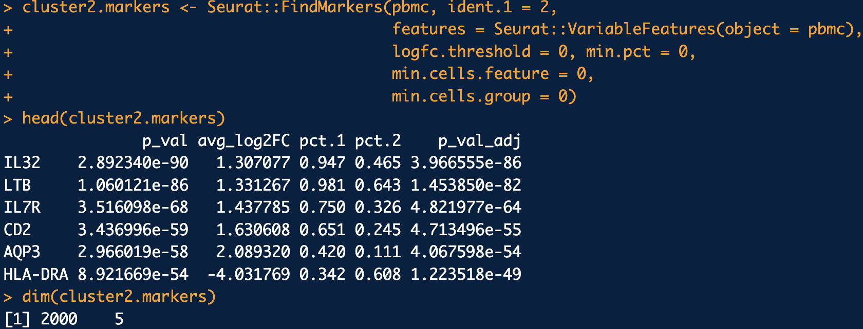
logfc.threshold = 0, min.pct = 0, min.cells.feature = 0, min.cells.group = 0. This is primarily done to ensure all the highly variable genes are tested. See the tutorial in https://satijalab.org/seurat/articles/pbmc3k_tutorial.html and https://satijalab.org/seurat/articles/de_vignette.
4.4.5 What if you want “valid” p-value?
There are a few instances where you truly valid p-values. That is, you want a way to perform hypothesis testing that doesn’t inflate the p-values (i.e., does not make the p-values more significant than they should be). Two papers you can look into towards this end are count splitting (Neufeld et al. 2022) or modifying the null distribution (Song et al. 2023).
4.4.6 A brief note on other approaches
There are an endless number of review and benchmarking papers for this topic. See (Das, Rai, and Rai 2022) for an overview of many methods, and (Dal Molin, Baruzzo, and Di Camillo 2017; Jaakkola et al. 2017; T. Wang et al. 2019; Li et al. 2022) for benchmarkings. This will also help you get a sense of how diversity of DE methods. Note that all the methods we mentioned so far are about differential mean (i.e., there is a shift in the average expression, relative to the variance). There are also mentions dedicated to differential variance (see (J. Liu, Kreimer, and Li 2023) for example) and differential distribution (see (Schefzik, Flesch, and Goncalves 2021) for example).
4.4.7 (A brief reminder about multiple testing)
In many scientific studies, particularly in genomics and high-throughput experiments, researchers perform thousands of statistical tests simultaneously. For example, in differential expression analysis of RNA-seq data, each gene is tested for association with a condition or phenotype. However, performing multiple tests increases the likelihood of false positives—tests that appear significant purely by chance. This challenge necessitates methods to control error rates, ensuring that conclusions drawn from these analyses are reliable. While traditional corrections like the Bonferroni method are overly stringent and reduce power, modern approaches such as the Benjamini-Hochberg procedure provide a balance between identifying true positives and controlling the rate of false discoveries.
4.4.8 Benjamini-Hochberg procedure
The Benjamini-Hochberg (BH) procedure is a widely used method to control the False Discovery Rate (FDR), defined as the expected proportion of false positives among all significant results. The procedure is particularly suited for large-scale testing scenarios where identifying as many true positives as possible is critical, while still limiting false discoveries.
Ordered p-values: Let \(p_1, p_2, \ldots, p_m\) represent the p-values for \(m\) hypothesis tests. First, these p-values are ordered in ascending order: \[ p_{(1)} \leq p_{(2)} \leq \cdots \leq p_{(m)}. \] The index \((i)\) denotes the position of the p-value in the sorted list.
Critical threshold: For a chosen FDR level \(\alpha\), the BH procedure identifies the largest \(k\) such that: \[ p_{(k)} \leq \frac{k}{m} \alpha. \] Here:
\(k\) is the rank of the p-value,
\(m\) is the total number of hypotheses tested,
\(\alpha\) is the desired FDR threshold (e.g., 0.05).
Significant results: Once \(k\) is identified, all hypotheses corresponding to \(p_{(1)}, p_{(2)}, \ldots, p_{(k)}\) are considered significant. This ensures that the expected proportion of false discoveries among these selected hypotheses is controlled at \(\alpha\).
The BH procedure achieves a balance between discovery and error control. Unlike family-wise error rate (FWER) methods such as Bonferroni, which aim to control the probability of any false positives, the BH method allows for a controlled proportion of false positives. This flexibility makes it more powerful in scenarios with a large number of tests, where the likelihood of finding true discoveries would otherwise be severely diminished.
The Benjamini-Hochberg procedure is a cornerstone of modern statistical analysis in high-dimensional data contexts. By controlling the FDR, it provides a practical and interpretable way to identify meaningful signals while accounting for the multiple testing problem. This approach is particularly valuable in genomics, proteomics, and other fields involving large-scale hypothesis testing.
4.4.9 How to do this in practice
Most DE methods compute the adjusted p-values for you. However, if you need to to do it manually, you can use the stats::p.adjust function with the setting method="BH".
4.4.10 A brief note on other approaches
BH can control a particular family of dependency structure called PRDS (Benjamini and Yekutieli 2001).
4.4.11 The volcano plot
A volcano plot is a scatterplot used in differential expression analysis to visualize the relationship between statistical significance and fold change for each gene. Genes are plotted with the magnitude of fold change on the x-axis and the negative logarithm of the p-value on the y-axis, making it easy to identify genes that are both significantly and highly differentially expressed. This intuitive layout highlights genes of interest as points far from the origin, often with up- and downregulated genes in separate clusters. See Figure 4.12 for an example of a volcano plot, and Figure 4.14 on how to make one.
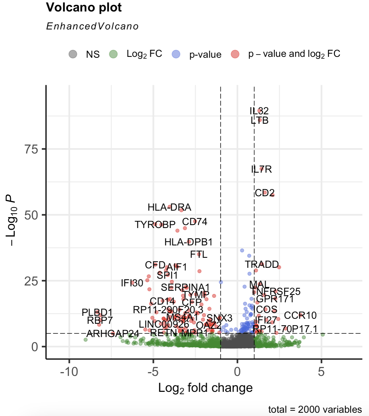
EnhancedVolcano::EnhancedVolcano(cluster2.markers, lab = rownames(cluster2.markers), x = 'avg_log2FC', y = 'p_val') function to make the volcano plot. See the tutorial in https://bioconductor.org/packages/devel/bioc/vignettes/EnhancedVolcano/inst/doc/EnhancedVolcano.html.
4.4.12 DE in human cohorts
Differential expression (DE) analysis in human cohorts introduces additional complexity due to the presence of numerous confounding variables. Factors such as age, sex, smoking status, genetic background, and even environmental exposures can influence gene expression and obscure the true biological signal related to the condition of interest. Effective DE analysis in this context requires robust statistical frameworks to adjust for these confounders, ensuring that observed differences in gene expression are genuinely associated with the biological or clinical variable being studied. While these adjustments add layers of complexity, they are critical for generating biologically meaningful and reproducible insights that can translate to broader human populations.
The broad strategies are:
- Pseudo-bulk analysis (the most common approach): Pseudo-bulk analysis aggregates single-cell data from each individual into a “bulk” profile by summing or averaging gene expression counts across cells of the same type. This approach treats each individual as a unit of analysis, enabling the application of well-established bulk RNA-seq differential expression methods, such as edgeR (Robinson and Smyth 2007) or DESeq2 (Love, Huber, and Anders 2014). (This methods were created for bulk-sequencing data.) By effectively reducing the dimensionality of the data, pseudo-bulk analysis accounts for inter-individual variability, which is critical in human cohorts. This method is particularly advantageous in case-control studies, where differences in gene expression between cases and controls can be analyzed while maintaining statistical power and controlling for confounders like age, sex, or sequencing depth.
Pseudo-bulk samples are created by aggregating single-cell gene expression data across cells within each sample/replicate/donor (depending on the context of the analysis). For donor \(r\), the pseudo-bulk expression count \(\tilde{X}_{rj}\) for gene \(j\) is obtained by summing the observed counts across all \(n_{r}\) cells belonging to that donor: \[ \tilde{X}_{rj} = \sum_{i \in \text{donor }r} X_{ij}, \] where \(X_{ij}\) is the observed count for gene \(j\) in cell \(i\) that came from donor \(r\). This aggregation reduces the sparsity inherent in single-cell data. Since some of the donors are “cases” and some are “controls”, pseudob-bulking allowing the use of standard bulk RNA-seq differential expression methods while preserving biological replicate structure.
- Mixture modeling: Mixture modeling is a more nuanced approach that acknowledges the heterogeneity within individual samples by modeling gene expression distributions across all cells. Instead of aggregating data, this approach identifies subpopulations of cells with distinct expression profiles and estimates the contribution of each subpopulation to the overall gene expression. In case-control studies, mixture models can distinguish changes in cellular composition (e.g., shifts in cell type proportions) from changes in gene expression within a given cell type. Mixture modeling is computationally intensive but offers a detailed view of the biological processes underlying disease states in human cohorts. This is mainly using the
lme4R package (or packages that build upon this, likeMAST::zlm), such as in (Y. Liu et al. 2023), or NEBULA (He et al. 2021).
Briefly, in its simplest form, a mixture model accounts for the hierarchical structure of the data, where cells are nested within donors. Consider a single gene \(j\). The observed expression \(X_{i(r),j}\) for cell \(i\) from donor \(r\) is modeled as: \[ X_{i(r),j} \sim P(X \mid \mu_r, \sigma^2), \] where \(\mu_r\) is the donor-specific mean expression, and \(\sigma^2\) captures the residual variability across cells within the donor. The donor-specific means \(\mu_r\) are modeled as: \[ \mu_r \sim \mathcal{N}(\beta_0 + \beta_1 z_r, \tau^2), \] where \(z_r\) is an indicator for case (\(z_r = 1\)) or control (\(z_r = 0\)) status, \(\beta_1\) is the effect of the condition, and \(\tau^2\) captures the variability in expression across donors. This hierarchical mixture approach explicitly separates within-donor variability from between-donor differences, ensuring that the analysis correctly attributes variability to its appropriate source.
- Distributional analysis: Another strategy is to leverage the fact that you have a distribution of cells for each donor. Hence, you can compute the mean and variance of the gene expression for each donor, and compare the donors through their mean and variance. One example of this is eSVD-De (Lin, Qiu, and Roeder 2024). However, this can also be done fully non-parametrically, such as in IDEAS (M. Zhang et al. 2022).
4.4.13 The standard procedure: DESeq2 (Pseudo-bulk analysis)
DESeq2 (Love, Huber, and Anders 2014) models read counts \(X_{ij}\) for gene \(j\) in sample \(i\) using a negative binomial (NB) distribution12: \[ X_{ij} \sim \text{NB}(\mu_{ij}, r_j), \] where \(X_{ij}\) is the total counts in sample \(i\) for gene \(j\) (which is the sum across all the cells in sample \(j\)), and \(\mu_{ij} = s_i q_{ij}\). Here, \(s_j\) is a normalization factor accounting for sequencing depth, and \(q_{ij}\) represents the normalized mean expression for gene \(j\) in sample \(i\). The NB distribution’s overdispersion is captured by \(r_j\), which varies across genes.
The design matrix \(Z\) specifies the \(r\) covariates of the samples (one of which is the experimental condition). Then, the log of the normalized mean expression \(q_{ij}\) is modeled as: \[ \log q_{ij} = \sum_{r} Z_{ir} \beta_{jr}, \] where \(\beta_{ir}\) are coefficients relating the covariates to the gene expression.
Dispersion parameters \(r_j\) are estimated using a shrinkage approach, where gene-wise estimates are pulled toward a trend fitted across genes with similar mean expression. Hypothesis testing for differential expression is based on Wald tests for the corresponding value of \(\beta_{jr}\).
4.4.14 A brief note on other approaches
See (Squair et al. 2021) and (Junttila, Smolander, and Elo 2022) for more references.
4.4.15 Aside: DE testing on normalized vs. count data
There are two fundamentally different approaches to performing differential expression (DE) analysis in single-cell RNA-seq data:
- DE on the Original Count Data: This approach involves applying statistical methods directly to the raw count data obtained from sequencing. It accounts for the inherent technical noise and sparsity characteristic of single-cell data by using models tailored to handle count distributions (e.g., negative binomial models). This method preserves the original variability and avoids introducing biases from data manipulation. Most of the different DE methods occur in this category (which we’ll discuss more in Section 4.4.12).
Remark 4.4. Remark (Personal guideline on when to use). In general, a lot of biological replicates (see Section 4.4.12) or have many covariates to adjust for, this is a more appealing option. Generally, you want to default to this option when you really want to have “valid” p-values (i.e., not just markers for convenient usage). That is, you expect your markers to be investigated in detail in followup work. This is because by modeling the original count nature, if you have an appropriate statistical model, you are more likely to have validity.
- DE on Processed Data: In this paradigm, the data undergoes preprocessing steps such as normalization, scaling, or transformation before DE analysis. Typically, when you’re using strategy, most people defer to the Wilcoxon test.
Remark (Personal guideline on when to use). In general, this option is most appealing when you want something “quick and dirty,” such as getting some interesting genes in a preliminary analysis to look at. This is because you’re off-loading all your concerns about statistical modeling to how the data was processed (i.e., the normalization, batch correction, etc.).
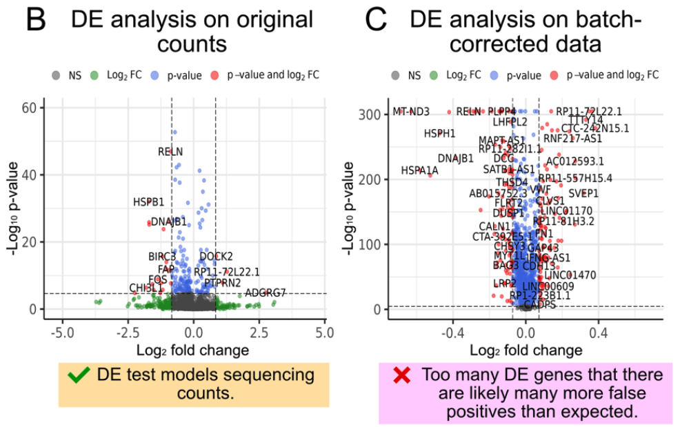
Caution on Processed Data: Do not impute or denoise your data by pooling information across genes or cells prior to DE analysis – unless you are fully aware of the consequences. Imputation or aggressive smoothing can introduce artificial correlations and inflate the signal, potentially leading to false positives and erroneous conclusions. This is because the “signal” from “true DE genes” is smoothed to impact the null genes. These processes can mask true biological variability and create spurious patterns that reflect the imputation model rather than the underlying biology. See Figure 4.15 for an illustration of this. There are some exceptions of this though – see eSVD-DE (Lin, Qiu, and Roeder 2024) and lvm-DE (Boyeau et al. 2023) for example.
In summary, while both paradigms aim to identify differentially expressed genes, they rely on different assumptions and have different risks associated with them. Performing DE on the original count data is generally safer and more reliable, provided that appropriate statistical models are employed. If you choose to perform DE on processed data, proceed with caution and be mindful of the potential pitfalls associated with data manipulation.
See (H. C. Nguyen et al. 2023) for empirical evidence on how DE interacts with batch-correction across different methods.
4.4.17 “DE” for a continuous covariate
As we’ll see later in Section 4.7, sometimes you want to see if a gene is correlated with a continuous covariate (often the estimated developmental stage of a cell). Typically, the way this is done is: fit a regression model (typically a form of GLM) to predict the continuous covariate based on a gene’s expression, and then perform a hypothesis test on whether the gene was relevant for the prediction. See (Hou et al. 2023) and its related papers for how methods do this.
Remark (Personal opinion: The distinct between categorical and continuous phenotypes). If you study a clinical phenotype (typically about the organism or overall tissue), you typically want to treat the phenotype as binary (or categorical). After all, a doctor cannot declare someone to “kinda” have cancer. You either have it or you don’t. (Think about how chaotic medication prescriptions, health insurance, follow-up treatments, etc. would be if doctors gave “kinda” assessments.) In medical practice, doctors are constantly updating the guidelines on how to diagnose samples accordingly discrete buckets of categorizations.
If you study a basic biology phenotype, you typically want to treat the phenotype as continuous variable. After all, nothing about a cell is ever discrete. Nothing is truly either “on” or “off”, and most ways to understand cells is along a gradient. For example, if you study DNA damage, it’s not very useful to simply know when a cell’s DNA is damaged. (It probably always is – however, most DNA damage present in a cell is probably minor and infrequent.)
4.5 Pathway analysis
Pathway analysis is a critical step in single-cell RNA-sequencing studies, providing a systems-level understanding of the biological processes and pathways underlying gene expression changes. Tools like Gene Ontology (GO) and Gene Set Enrichment Analysis (GSEA) are commonly used to identify functional themes within a set of differentially expressed or highly variable genes. Gene Ontology categorizes genes into hierarchical groups based on their roles in biological processes, molecular functions, or cellular components, offering a structured framework for interpreting gene expression patterns. GSEA takes this further by testing whether predefined gene sets, representing pathways or functional categories, are enriched in a given cell cluster or condition. These approaches are particularly valuable in single-cell analysis, where individual genes may have noisy or sparse expression patterns. By focusing on groups of related genes, pathway analysis mitigates noise, enhances biological interpretability, and highlights broader functional insights that single genes alone may not reveal.
Input/Output. The input to a pathway analysis is: 1) a vector of \(p\) values, one for each gene, and 2) a database that contains many pathways (and which genes belong to that pathway). Importantly, this must be a named vector (i.e., you know which value corresponds to which gene). The output is one p-value per pathway which denotes how significant the genes in the pathway are not randomly distributed based on their value. That is, a significant pathway is one where many of genes are have simultaneously very large (or very small) values.
4.5.1 The standard procedure: GSEA
Gene Set Enrichment Analysis (GSEA) is a widely used computational method designed to determine whether predefined sets of genes exhibit statistically significant differences in expression between two biological states. Unlike single-gene analyses, which focus on individual genes, GSEA evaluates groups of related genes (gene sets) to identify coordinated changes in expression patterns. This approach provides a more systems-level understanding of the underlying biology, particularly in settings where individual genes show subtle expression changes.
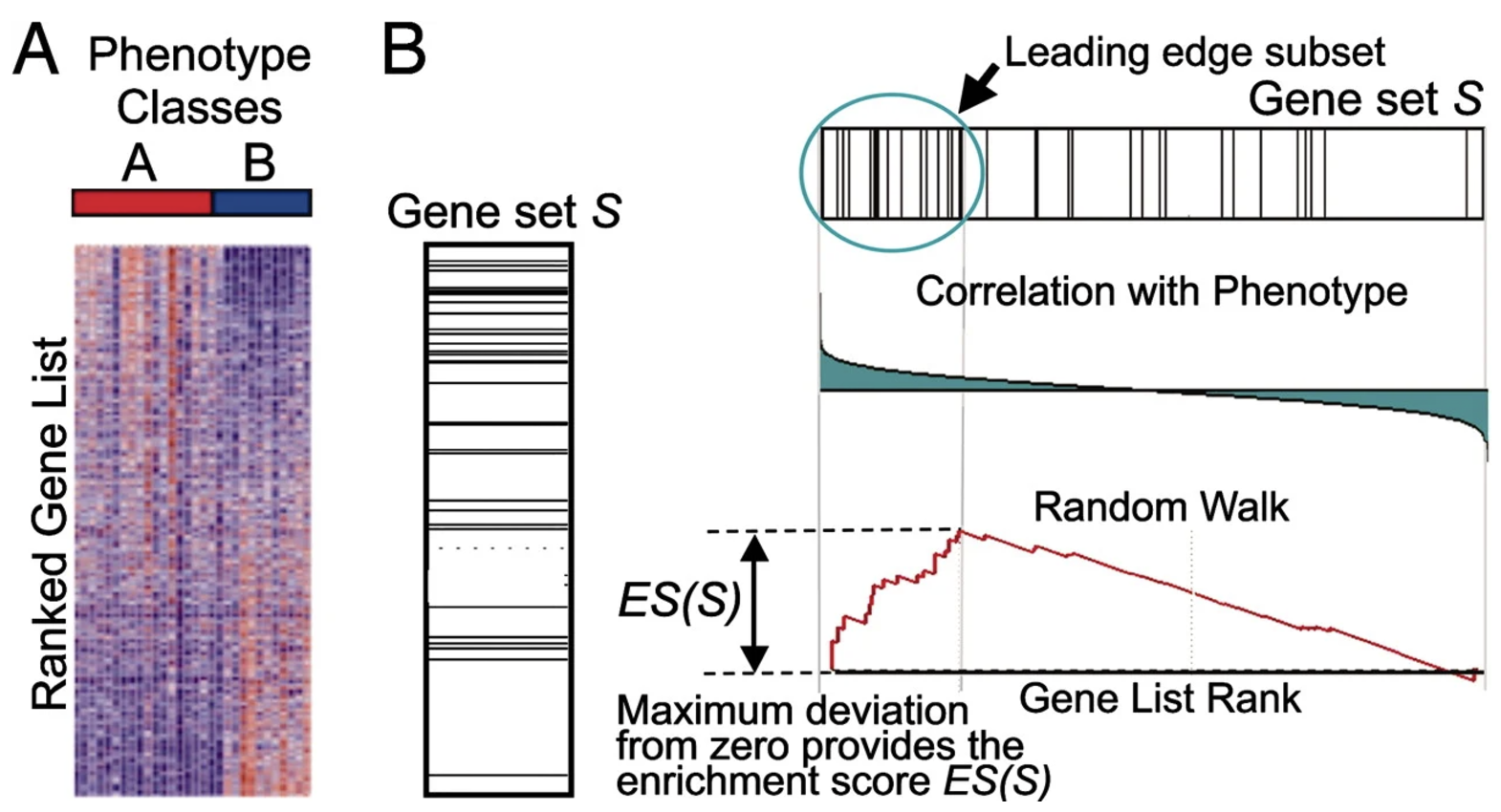
The goal of GSEA is to test whether a predefined gene set \(S\), such as a pathway or functional group, is overrepresented among the genes most differentially expressed between two conditions. GSEA leverages ranked gene lists, focusing on the distribution of gene set members within the list to detect enrichment. See Figure 4.16 for an illustration of how the method works visually.
- Input data: GSEA requires the following inputs:
- A ranked list of genes \(G = \{g_1, g_2, \ldots, g_N\}\), sorted by their differential expression scores (e.g., fold change, t-statistics, or signal-to-noise ratio) between two conditions.
- A predefined gene set \(S \subseteq G\), typically representing a biological pathway, molecular function, or cellular process.
- The test statistic (Enrichment score, i.e., ES): The core of GSEA is the calculation of an enrichment score (ES), which reflects the degree to which the genes in \(S\) are concentrated at the top (or bottom) of the ranked list \(G\). The ES is computed by walking down the ranked list and increasing a running-sum statistic when encountering a gene in \(S\), or decreasing it otherwise: \[ \text{ES} = \max_k \left| P_S(k) - P_G(k) \right|, \] where:
- \(P_S(k)\): Cumulative sum of weights for genes in \(S\) up to rank \(k\).
- \(P_G(k)\): Cumulative sum of weights for all genes up to rank \(k\).
The weights often depend on the absolute value of the gene’s differential expression score, emphasizing genes with larger effects.
- The null distribution: To assess the significance of the observed ES, GSEA employs a permutation-based strategy:
- Permute the condition labels to generate randomized ranked lists.
- Recalculate the ES for the gene set \(S\) in each randomized list.
- Compare the observed ES to the null distribution of ES values from the permutations to compute a p-value.
- Multiple testing adjustment: Since many gene sets are tested in a typical GSEA analysis, corrections for multiple hypothesis testing are essential. GSEA uses the false discovery rate (FDR) to control for false positives, reporting gene sets with significant enrichment after correction.
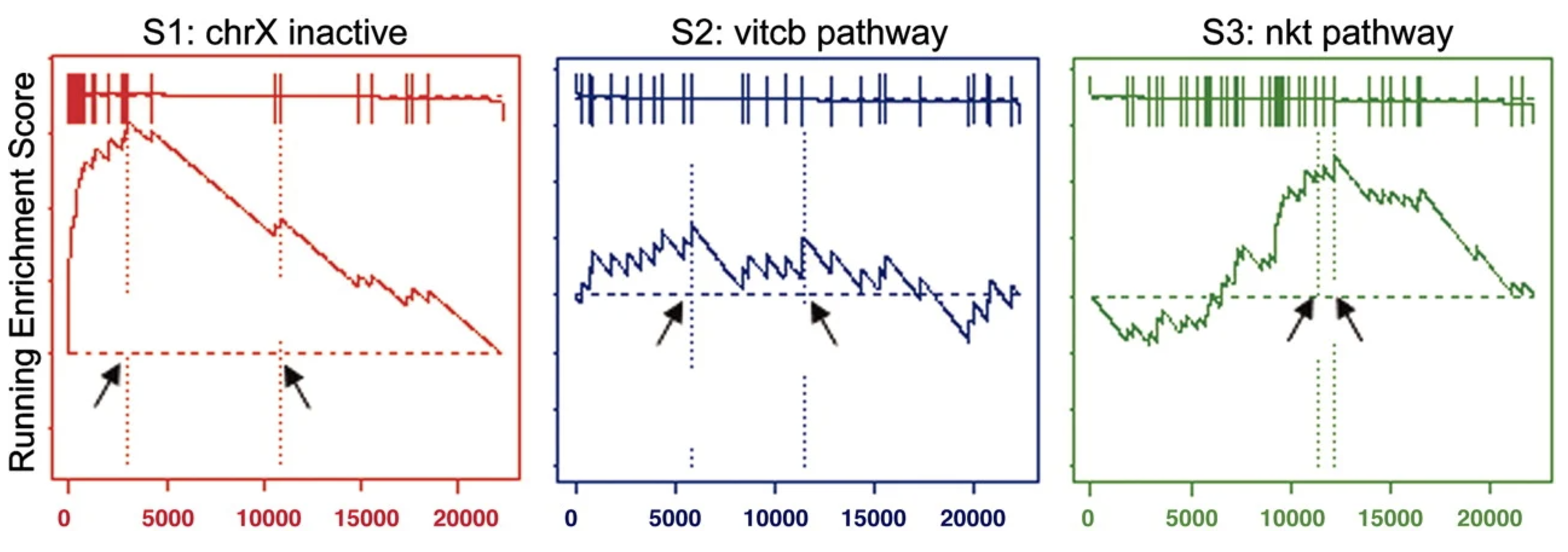
GSEA outputs enriched gene sets ranked by their statistical significance and direction of change (positive or negative ES). These results highlight biological pathways or processes that are upregulated or downregulated between conditions. For example: (1) In cancer studies, GSEA might identify pathways like “cell cycle” or “apoptosis” as significantly enriched. (2) In immune response research, pathways such as “inflammatory response” or “antigen processing” may be highlighted.
Some advantages of GSEA:
- Sensitivity to Subtle Changes: GSEA detects coordinated changes in groups of genes, even when individual genes show modest differential expression.
- Biological Context: By focusing on gene sets, GSEA provides results that are easier to interpret in the context of known biological processes or pathways.
- Robustness: GSEA is less affected by noise or variability in individual genes, as it aggregates signals across entire gene sets.
Despite its strengths, GSEA has limitations:
- Gene Set Overlap: Many gene sets share overlapping genes, complicating interpretation.
- Ranking Dependence: Results depend heavily on the ranking metric used.
- Predefined Gene Sets: GSEA relies on the quality and relevance of predefined gene sets, which may not fully capture novel or context-specific biology.
4.5.2 A brief note on other approaches
Extensions to GSEA address some of these issues, including pathway-specific weighting, time-series GSEA, and single-cell adaptations of the method. One example to illustrate this is iDEA (Ma et al. 2020). These methods aren’t hugely popular since this procedure is quite literally often one of the last stages of a single-cell analyses – using a fancy method here usually requires you to have faith that every analyses beforehand was performed reliably. (For instance, if you don’t think you performed batch correction properly, it doesn’t matter if you use the fanciest variant of GSEA – you’ll probably still find nothing biologically relevant.) See (Mubeen et al. 2022) for an overview of many methods.
4.5.3 How to do this in practice
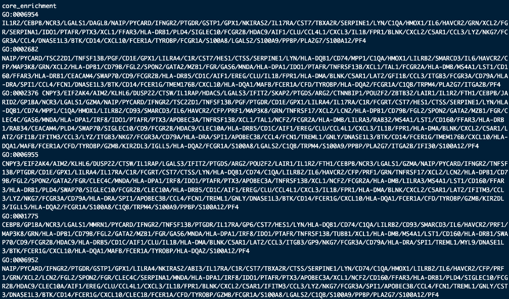
The most popular package to perform a GSEA analysis is clusterProfiler::gseGO. See https://yulab-smu.top/biomedical-knowledge-mining-book/clusterprofiler-go.html for tutorials on how to do this. If you’re working on human data, the database used for GSEA is often the org.Hs.eg.db package, see https://bioconductor.org/packages/release/data/annotation/html/org.Hs.eg.db.html. See the following code snippet and the outputs in Figure 4.18 and Figure 4.20 as an example.
teststat_vec <- cluster2.markers$avg_log2FC names(teststat_vec) <- rownames(cluster2.markers) teststat_vec <- sort(teststat_vec, decreasing = TRUE) set.seed(10) gse <- clusterProfiler::gseGO( teststat_vec, ont = “BP”, # what kind of pathways are you interested in keyType = “SYMBOL”, OrgDb = “org.Hs.eg.db”, pvalueCutoff = 1, # p-value threshold for pathways minGSSize = 10, # minimum gene set size maxGSSize = 500 # maximum gene set size ) head(as.data.frame(gse))
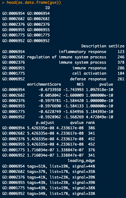
head(as.data.frame(gse))
head(as.data.frame(gse))
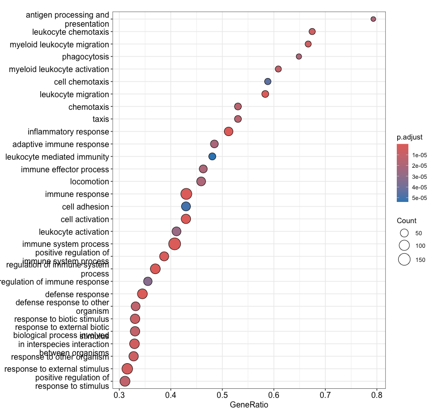
clusterProfiler::dotplot(gse, showCategory=30)
4.6 Cell-type labeling, transfer learning
Cell-type labeling is a critical step in single-cell RNA-sequencing analysis, where the goal is to assign meaningful biological identities to cell clusters or groups. Traditionally, this process relies on manual annotation using known marker genes, which can be time-consuming and subjective. Transfer learning has emerged as a powerful alternative, leveraging reference datasets with well-annotated cell types to predict labels for new datasets. By applying machine learning models trained on these references, transfer learning enables automated, scalable, and more consistent cell-type annotation. This approach is particularly valuable for studies with large datasets or when analyzing data from underexplored tissues or conditions. Despite its utility, challenges remain, such as aligning datasets across technical platforms or accounting for differences in cell-state diversity, but the method continues to refine and enhance the accuracy and efficiency of cell-type labeling.
Input/Output. The input to cell-type labeling is two matrices, a reference dataset \(X^{(\text{ref})} \in \mathbb{R}^{n_1\times p}\) for \(n_1\) cells and \(p\) features (i.e., genes) where all \(n_1\) cells are labeled (and hence, why it’s called a “reference” dataset), and another dataset which is unlabeled and is the interest of your study, \(X^{(\text{target})} \in \mathbb{R}^{n_2\times p}\) for \(n_2\) cells and the same \(p\) features. If there are \(K\) clusters in \(X^{(\text{ref})}\), the goal is to label each of the \(n_2\) cells in \(X^{(\text{target})}\) with one (or more, or possible none) of the \(K\) clusters.
4.6.1 Strategy 1: Good’ol marker genes
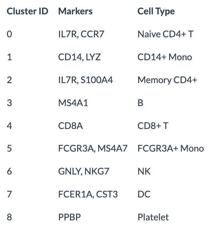
Cell-type identification using marker genes is a typical choice in single-cell RNA-seq analysis. This is typically performed after clustering cells into groups with similar gene expression profiles. This process involves leveraging existing literature to associate marker genes identified for each cluster with known cell types. While this approach requires significant manual effort and domain expertise – making it a human-in-the-loop process – this can be both its strength and its limitation. The manual aspect ensures transparency and allows researchers to contextualize results within the biology of the experiment, drawing on their understanding of the literature and experimental design.
Some drawbacks of this approach: 1) It can be labor-intensive, dependent on the quality of prior knowledge, and requires the data analyst to have quite some expertise with the biological system. After all, you will need to figure out the most reliable set of genes to use – this will inevitably require you know have read quite a few papers to see which markers are commonly used by the community. 2) A more limiting drawback is that you will not be able to label “new” cell types in your dataset that do not have already established marker genes. After all, if you are “missing” the marker genes for a particular cell type, you might not even realize that that cell type is in your dataset.
Despite these challenges, this method remains the most widely used because it minimizes the risk of major errors going unnoticed, making it a reliable approach for annotating cell types.
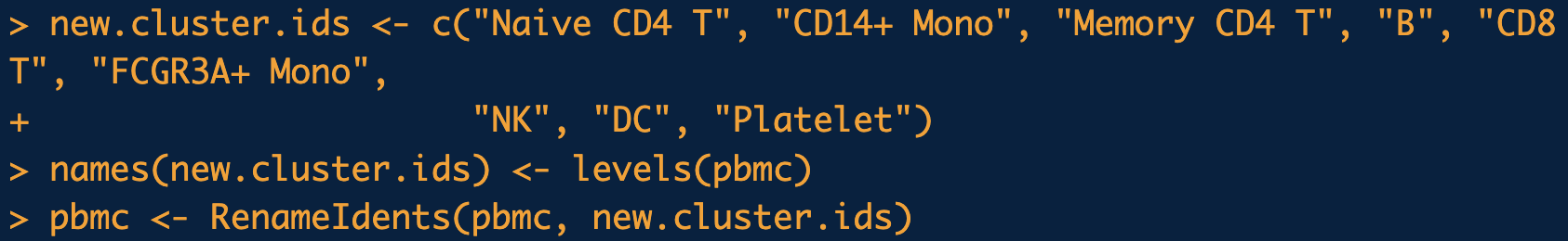
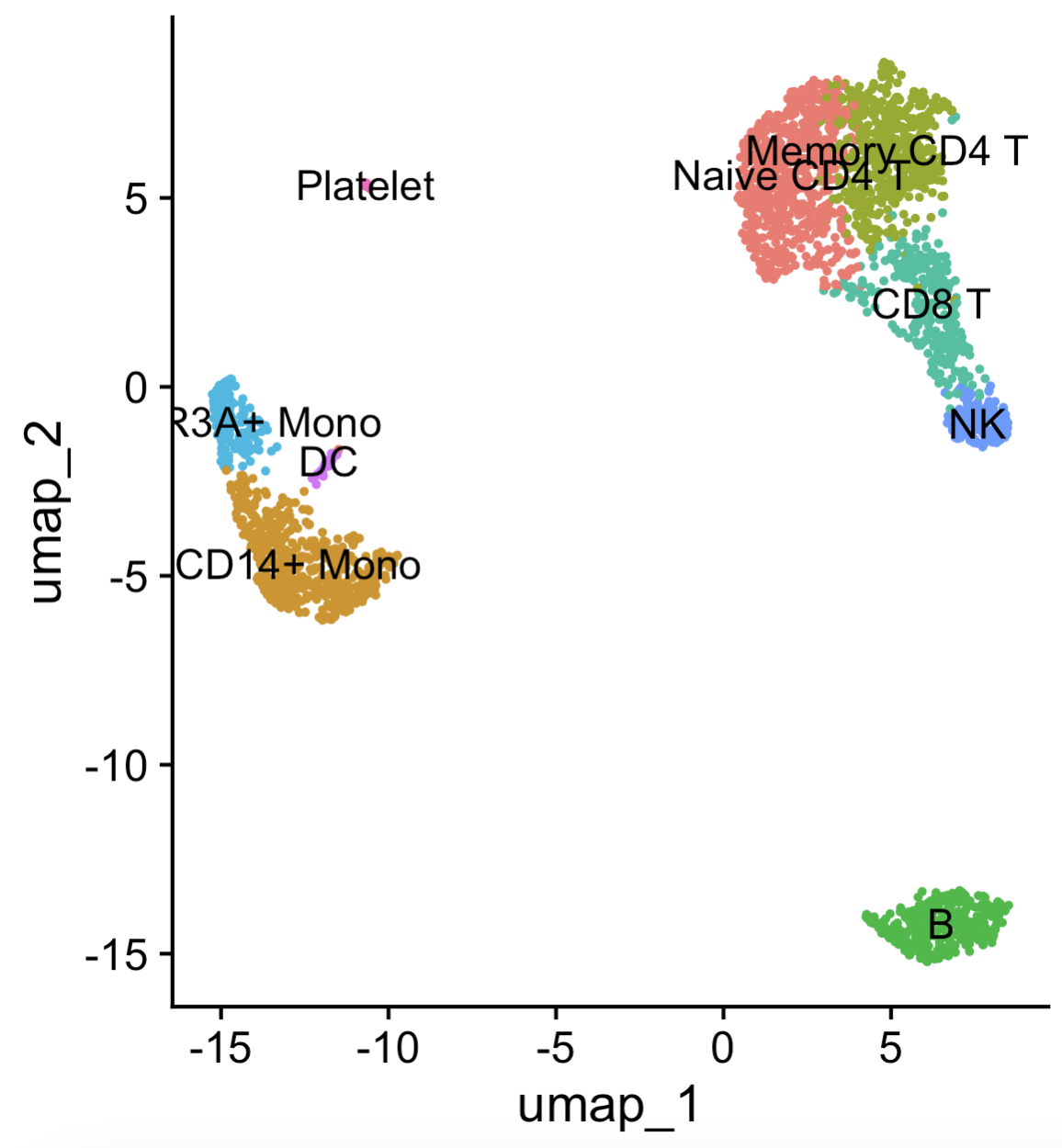
DimPlot(pbmc, reduction = "umap", label = TRUE, pt.size = 0.5) + Seurat::NoLegend() function to visualize the data with the cell-type labels. (By default, the “labels” come from Seurat::Idents, which is set to the latest clustering by default. See the tutorial in https://satijalab.org/seurat/articles/pbmc3k_tutorial.html.
4.6.2 In relation to scoring a gene-set
Recall in Section 3.3.3 that we often create a score for the percentage of expression originating from the mitochondria genes for cell-filtering. The Seurat::PercentageFeatureSet function to do this does exactly what it sounds like – it computes the percentage of counts originating from the genes in the gene set (relative to all the counts in the cell).
There are fancier methods to compute this enrichment score (i.e., a score where a higher number denotes that that gene set is “more active” in a cell). Two popular methods for this account for the “background distribution” (UCell, (Andreatta and Carmona 2021)) or the gene regulatory network (AUCell, (Aibar et al. 2017)).
4.6.3 Strategy 2: Deploying a classifier/Transfer learning
In the earlier days of single-cell analyses, there were quite a few methods that had you build a cell-type classifier on a reference dataset which had cell-type labels (typically developed by a large consortia, where you trust the cell-type labels) and you deploy the classifier on your dataset of interest. The classifier here predicts the cell type based on the gene expression. For instance, you can see (Abdelaal et al. 2019) which has relevant references. While these are probably the most statistically transparent, it usually takes a bit of time to learn the details of these methods to understand how statistically sound they are.
There are a few aspects of statistical interest in this direction:
Classification with abstain/rejection: It is possible to design a classifier with a “reject” or “abstain” option. This way, if the classifier is unsure about the cell type label, then it can refuse to give a cell-type prediction. For instance, see scPred (Alquicira-Hernandez et al. 2019) and Hierarchical Reject (Theunissen et al. 2024) for one way this can be done.
Conformal inference: Conformal inference is a large statistical theoretical field. Essentially, instead of predicting one cell type, the method returns a set of potential cell types. (This is a different way to design methods with an abstain option, since a cell with an empty prediction set would essentially “abstain.”) See (Khatri and Bonn 2022) for an example.
Transfer learning: This is the more commonly option done nowadays in this category. The term “transfer learning” refers to training a classifier on the reference dataset and then slightly modifying it (i.e., “transfer”) in order to your dataset of interest. Some examples of this is scArches (Lotfollahi et al. 2022) and its extension in treeArches (Michielsen et al. 2023).
Some drawbacks: The main drawback is due to batch effects. After all, “by definition,” the dataset you’re analyzing is very likely coming from a different research lab/consortium that produced the reference dataset. While statistical theory offers great ways to diagnose a classifer assuming the training and test data originate from the same source, it is much harder to take advantage of this statistical theory if you blatantly know this is not the case.
4.6.4 Strategy 3: Data integration
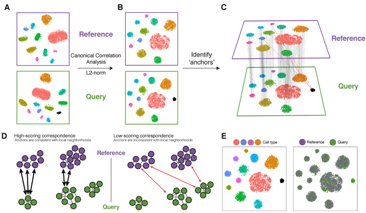
Dataset integration has become a widely used approach for cell-type labeling, especially when marker genes are not readily available. This strategy involves integrating a new dataset with an existing reference, often using methods that align the datasets in a shared space. Once integrated, cells in the new dataset are labeled based on their nearest neighbors in the reference. While this approach is powerful, it has limitations. A key advantage of this method is its visual interpretability; researchers can assess the alignment of the datasets in a low-dimensional embedding, adding a layer of protection against mislabeling or other errors. See Figure 4.24 for a schematic.
A few notes:
- We sometimes use the verb “align” two datasets or “project” one dataset onto another. Note that we’re just using these verbs conceptually, not in a literal statistical sense.
- Many methods used for batch correction (see Section 3.3.19) can be repurposed for this task.
- Be warned though: integration can sometimes “collapse” distinct points in the data, potentially masking subtle differences or even preventing the discovery of new cell types.
For some canonical examples of these methods: Using CCA ((Butler et al. 2018) and its followup, (Stuart et al. 2019)), using cell-cell graphs (MNN (Haghverdi et al. 2018) and Harmony (Korsunsky et al. 2019)), and regression (COMBAT-seq (Yuqing Zhang, Parmigiani, and Johnson 2020)). However, by far the most common way to do this currently is through deep-learning (which can be interpreted as a form of transfer learning, see scANVI (Xu et al. 2021) for example).
Just to give you small taste of some of these above methods:
Anchor pairs via CCA: (Stuart et al. 2019) essentially is a 3 step process: 1) first find many pairs of cells (one in your dataset, one in the reference) that are similar based on CCA, and then 2) use those pairs of cells to learn a transformation on how to convert the cells in your dataset into the cells in the reference dataset. Then, apply this transformation to all cells in your dataset.
Clustering and shrinking via Harmony: (Korsunsky et al. 2019) essentially is a 2 step process: 1) first cluster all the cells in both datasets together (yours with the reference dataset), where you want a clustering where each cluster represents a good mixture of cells from each dataset, then 2) “shrink” all the cells in each cluster towards its cluster center. Essentially, you treat the differences between cluster as “biological signal,” while the variability within a cluster as “technical noise.”
Deep-learning (i.e., a really fancy regression), via scANVI: (Xu et al. 2021) essentially use one framework to: 1) learn a way to project all the cells in both datasets into one low-dimensional space where the low-dimensional space is “independent” of the dataset label (i.e., given a cell’s low-dimensional space, you can’t predict which dataset the cell came from), and then 2) combine a cell’s low-dimensional space with its dataset label to reconstruct the original gene expression (which is to ensure that the low-dimensional space was a meaningful representation).
4.6.5 How to do this in practice
There’s not standardize way to do this, but I would personally recommend data integration using Harmony, where you integrate your (unlabeled) dataset of interest with a reference dataset with cell-type labels. See Section 3.3.19.
4.6.6 A brief note on other approaches
See (Abdelaal et al. 2019; Mölbert and Haghverdi 2023) for benchmarking of cell-type labeling methods.
Note that cell-type labeling is popularly being integrating into web-based all-in-one (i.e., “one-stop-shop”) platforms that automatically label your cells (see Azimuth (https://azimuth.hubmapconsortium.org/) and CellTypist (https://www.celltypist.org/) as an example). This is because cell-type labeling through writing your own code can be quite fickle that requires a lot of biological expertise to know what is “sensible”, so it’s beneficial to offload this concern to a platform. See (Tran et al. 2020; Luecken et al. 2022; Lance et al. 2022) (among many) that benchmark the dataset integration methods.
Remark (The big challenges in cell-type integration). Broadly speaking, there are three major challenges in cell-type integration:
How do you pick the appropriate reference dataset?: (Mölbert and Haghverdi 2023) discusses the impact of the reference dataset itself. (Of course, using a different reference dataset will change your cell type labeling, so it’s important to plan beforehand how you will defend the critique of whether you even have an appropriate reference dataset.)
How “heavy-handed” do you want your integration to be?: If you have longitudinal samples (i.e., tissue from the same donors at different points, say, based on followup visits after therapy), these samples might be on different sequencing batches. This presents a unique conundrum – how can you differentiate between a “batch effect” and a “true biological effect due to different timepoints”? You might be interested to see papers such as CellANOVA for this (Z. Zhang et al. 2024). Even if you don’t have longitudinal samples, sometimes certain integration methods to overboard and merge too much together. For example, one of the reasons some researchers prefer reciprocal PCA to do integration (see https://satijalab.org/seurat/articles/integration_rpca.html) is precisely because it’s more “conservative” (i.e., is less aggressive in trying to remove batch effects). How will you, as the data analyst, determine how much is too much?
How do you know if your dataset contains cell types not in the reference?: If your dataset of interest has many cell types that aren’t in the reference, your data integration method might unknowingly wipe all this signal away since it is doing its job – it’s trying to integrate the two datasets together, under the pretense that both datasets are “similar.” This is where different methods start to exhibit different behavior. You might be interested in looking at methods such as popV (Ergen et al. 2024) that try to build a “uncertainty score.” (Many modern dataset integration methods now have this feature. However, you should always take these scores with a grain of salt since you can’t be too sure how calibrated these scores are.) CASi (Y. Wang et al. 2024) offers a different perspective on how to answer “in a longitudinal experiment, how do I even know if a new celltype emerges?”
My personal opinion? The best batch correction strategy is to do careful experimental design. One common strategy is to have a “control” tissue that you put into every sequencing run. That way, even across your different sequencing batches, you will have one set of cells that should be the same across every batch. This helps you get some additional clues on when a batch correction method is performing well.
4.7 Trajectory analysis
Trajectory analysis aims to reconstruct the dynamic processes underlying cellular transitions, such as differentiation or response to stimuli, by organizing cells along a pseudotime axis. This is particularly valuable in single-cell RNA-sequencing studies, where cells are often sampled as a snapshot, rather than longitudinally, making it challenging to infer temporal relationships. Methods for trajectory analysis typically rely on one of two approaches: geometric relationships or biophysical models. Geometric methods use structures like cell-cell nearest-neighbor graphs to infer trajectories and identify branching points, capturing transitions and bifurcations in cell states. Alternatively, biophysical models leverage biological priors, such as splicing kinetics, gene-regulatory network dynamics, or metabolic states, to assign cells to pseudotime. Despite the complexities of inferring trajectories from static data, these approaches have proven effective in uncovering developmental pathways, understanding disease progression, and identifying rare transitional cell states. Trajectory analysis thus provides a framework to explore cellular dynamics in the absence of direct time-course experiments.
Input/Output. The input to trajectory analysis is typically a matrix \(X\in \mathbb{R}^{n\times k}\) for \(n\) cells and \(k\) latent dimensions. Depending on which trajectory method you’re using, you might need more inputs (such as cell clusters, specific cells that denote the start or end of the trajectory, etc.). The output is typically two things: 1) the pseudotime for each cell (i.e., a number between \(0\) and \(1\) for each cell), and 2) the trajectories (i.e., the order of which cells or cell clusters develop/reprogram into which other cells or cell clusters).
4.7.1 A typical choice: Monocle
Monocle (Trapnell et al. 2014) is a computational framework designed to infer the trajectory of single-cell gene expression profiles as they progress through a dynamic biological process, such as differentiation or reprogramming. It constructs a “pseudotime” ordering, which assigns a continuous value to each cell based on its transcriptional state, representing its progression along the biological process. This method is illustrated as a schematic in Figure 4.25.
The method begins by representing the gene expression profile of each cell as a point in a high-dimensional space \(\mathbb{R}^d\), where \(d\) is the number of genes measured. To reduce noise and computational complexity, Monocle uses dimensionality reduction techniques, such as Independent Component Analysis (ICA), to project the data into a lower-dimensional space.
Next, Monocle constructs a Minimum Spanning Tree (MST) in this reduced space. Each cell is treated as a node, and edges represent transcriptional similarity between cells, with weights corresponding to distances in the reduced space. The MST serves as the backbone for the trajectory and is used to identify the longest connected path, representing the main pseudotemporal progression.
Mathematically, pseudotime \(\tau_i\) for a cell \(i\) is defined along this trajectory as: \[ \tau_i = \sum_{j=1}^{i} d(c_j, c_{j+1}), \] where \(d(c_j, c_{j+1})\) is the geodesic distance between successive cells \(c_j\) and \(c_{j+1}\) along the path.
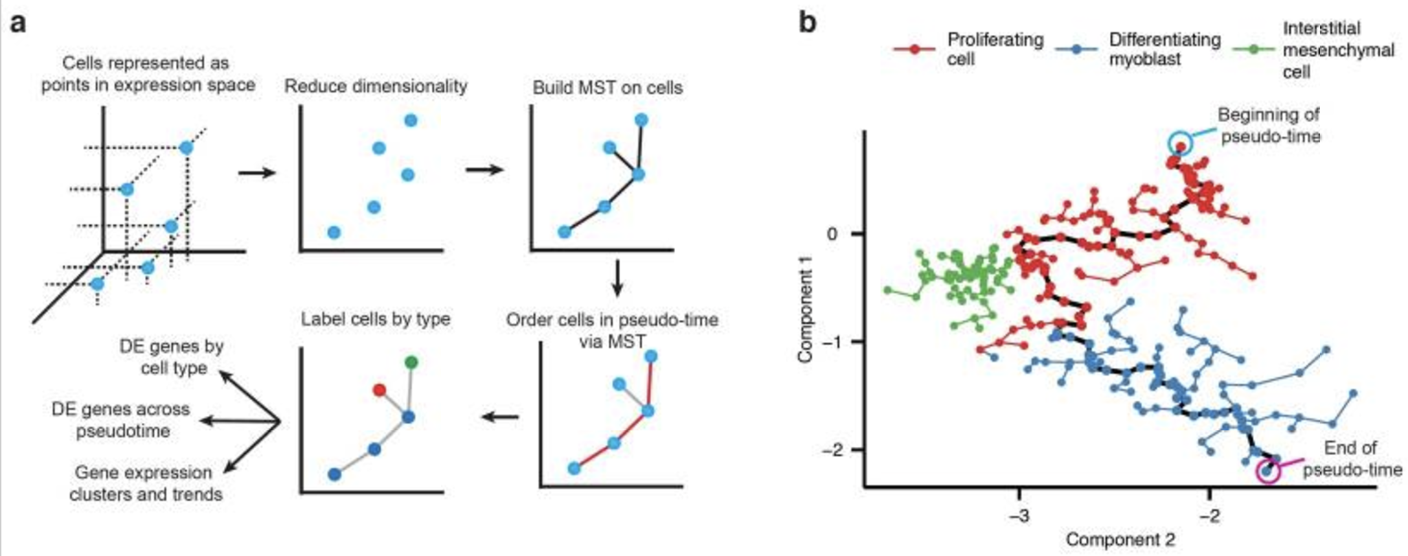
4.7.2 How to do this in practice
There is no standardized way for trajectory analysis. However, Monocle13 is quite popular because: 1) it was one of the first ways developed to do trajectory analyses, 2) it is quite modular (so different researchers can switch out specific aspects for another), 3) each step is quite transparent mathematically, and 4) the software is well maintained and runs reasonably quickly.
4.7.3 A highly active area of research: How much biology does your premise assume is true?
Methods such as Monocle intrinsically assume that two cells in gene expression is a good proxy of both cells at a similar biological stage. In general, this is a huge assumption, and it has been shown to not hold in various settings. For instance, see (Saunders et al. 2023), or multi-omics in Chapter 5 and lineage-tracing in Chapter 8. (It’s possible that the transcriptome is not the most accurate omic to track cell development/response.)
However, other methods based on the transcriptome could rely on different assumptions on how the biology relates to the math. Just to give some examples, Slingshot (Street et al. 2018) assumes the biological premise of Monocle and adds that the trajectory must be strictly branching. CytoTRACE (Gulati et al. 2020) instead assumes that as cells develop, there are less genes that are expressed. RNA velocity methods such as velocyto (La Manno et al. 2018) assume there is spliced/unspliced relation in mRNA fragments that can be used to learn a cell’s developmental stage, which offers a potentially more mechanistic perspective on how to learn the cell trajectories.
A brief note on other approaches: See (Saelens et al. 2019; Cannoodt et al. 2021; Yifan Zhang et al. 2023) for large benchmarkings of various RNA velocity methods. See (Ancheta et al. 2024) for a benchmarking specific to RNA velocity.
4.7.4 Talk to me about statistics: What makes this topic criminally difficult?
Trajectory inference is a challenging statistical problem because it combines elements of both unsupervised and supervised learning in a highly complex setting. On one hand, it is unsupervised because you do not know the true pseudotime or branching structure of the data – these must be inferred from the observed high-dimensional gene expression profiles. On the other hand, it has a supervised flavor, as the goal is often to reconstruct a biologically meaningful trajectory that aligns with an underlying developmental or dynamic process. This dual nature makes the problem particularly tricky.
Several assumptions exacerbate the difficulty (see (Saelens et al. 2019)):
- Unknown time and branching structure: The exact ordering of cells and the number or nature of branches in the trajectory are unknown. Inferring these from noisy and sparse single-cell data is highly nontrivial.
- Assumption of a trajectory: You are implicitly assuming that the data follows a trajectory, but not all biological processes have a well-defined or continuous progression. If the underlying process is more stochastic or does not follow a clear path, the trajectory inference may be misleading.
- Equal representation across pseudotime: Many methods assume an approximately equal number of cells sampled across all stages of the trajectory, but real datasets often have uneven representation, which can bias the inferred pseudotime or branching structure.
Remark (Personal opinion: Lack of flushed-out statistical theory). A typical statistical theorem goes: 1) I have a specific data model in mind that tells me how data is generated, 2) I have an specific aspect about this model that I do not get to observe, but I wish to estimate from data, and then 3) based on a novel estimator, I can prove that as I get more data, under some reasonable assumptions, I can estimate the unknown aspects better and better.
In general, I have not seen this convincingly been done at all for almost any trajectory analysis for single-cell methods. This is due to the complexity of the biological assumptions you have justify, all the modeling assumptions you have justify (shown above), and then all the crazy proof techniques you would need to carefully manage to show how you can cast a natively unsupervised statistical problem into a supervised one.
This isn’t to say trajectory methods are not trustworthy. Certainly, these methods have uncovered tremendous biological insights. My comment here is that a lot of our understanding of trajectory methods is driven by the biological context, not so much by our mathematical insight.
4.8 Concluding thoughts about scRNA-seq: Why bother with anything else?
4.8.1 Limited biological insights from scRNA-seq matrices
Recall Remark 4.1, which highlights how much biological information is discarded during typical scRNA-seq workflows, particularly by tools like CellRanger. While the raw reads may contain rich and valuable insights – such as information on splicing, untranslated regions (UTRs), and alternative polyadenylation sites (APAs) – these are often overlooked in downstream analyses. If your analysis starts solely from the count matrix, you might miss significant aspects of cellular biology. For a broader perspective on what scRNA-seq still lacks, both biologically and methodologically, see review papers like (Lahnemann et al. 2020). Additionally, for those interested in computational challenges in single-cell analysis, resources like https://openproblems.bio/events/ provide an excellent starting point.
4.8.2 Limited biological understanding of mRNA fragments
It’s important to remember that scRNA-seq primarily focuses on associating gene expression with biological phenomena. While we have a detailed map of gene expression, there is often limited context or understanding of how these genes interact functionally. mRNA fragments don’t act in isolation; their roles are inherently connected to proteins, cellular structures, and interactions with other cells. Moreover, scRNA-seq lacks direct insights into the functional impact of gene expression changes (as opposed to massively parallelized reporter assays), ignores temporal dynamics (as time information is lost when cells are lysed, as opposed to live-cell imaging), and omits structural context like cellular shape and protein localization (as opposed to other imaging technologies).
4.8.3 Translational limitation of scRNA-seq, and bulk deconvolution
As we showed in the footnotes of Section 4.2, scRNA-seq is extremely expensive. This makes any scRNA-seq technology quite unlikely to become a routine tool in clinical settings like hospitals. This is one of the main appeals of bulk deconvolution methods (where you can estimate cell-type proportions for many tissues for many donors, see (Cobos et al. 2023; H. Nguyen et al. 2024; Maden et al. 2023)), since bulk RNA sequencing is a lot cheaper than scRNA sequencing.
4.8.4 Not all RNA is mRNA
If you have not studied biology before, it might shock you to realize that mRNA is only one specific type of RNA molecules. See Figure 4.26 for all the different types of mRNA molecules. mRNA is simply the only RNA molecules to become translated into proteins. In fact, this is only from 1%-5% of all RNA molecules in a cell14. There is incredible biology being done to investigate the other roles of the other RNA molecules, for instance lncRNA (Statello et al. 2021) and microRNA (Shang et al. 2023).
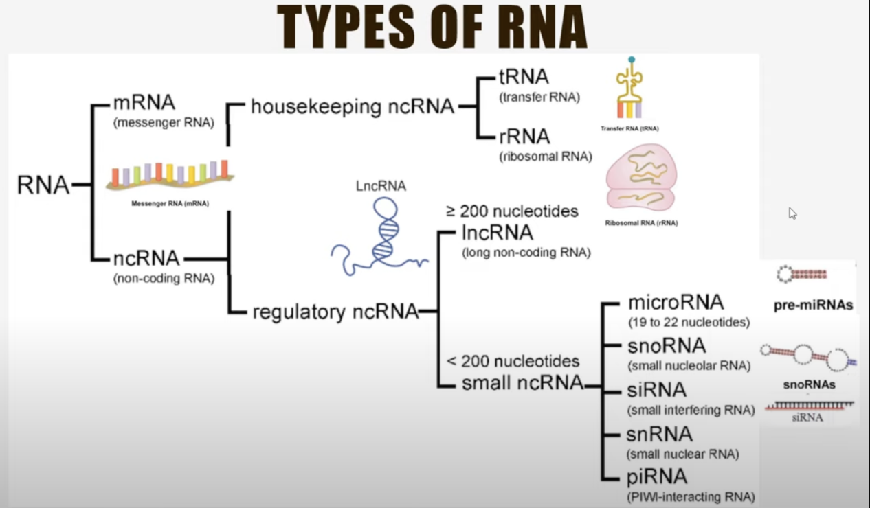
4.8.5 Importance of other omics
To truly understand the complexity of cellular systems, we need to integrate information from multiple modalities. This idea can be illustrated by the “blind men and the elephant” analogy, Figure 4.27: each single-cell modality provides only a partial perspective of the whole, and no single technology can offer a complete picture. For instance, scRNA-seq captures transcriptional snapshots, while other methods focus on proteins, chromatin, or spatial organization. Combining these modalities is essential to gain a holistic view of cellular function and dynamics.

Remark (Personal opinion: The abundance of computational tools for scRNA-seq doesn’t necessarily reflect its importance as an omic, but rather its standardization and well-organized data structure). The explosion of computational tools for scRNA-seq, particularly from 3’ short-read technologies, is less about it being the most biologically critical modality and more about the ease of working with the data. The technology is highly standardized, producing consistent and structured outputs, such as count matrices, that are straightforward to analyze. This standardization has enabled rapid tool development and widespread adoption, creating a feedback loop where more tools emerge as the data becomes more accessible. See (Eisenstein 2020) for an opinion piece.
Remark (The quadruple threat in cell biology). Suppose you collect data, analyze it, and realize your findings don’t align with current biological knowledge. Depending on your expertise, you might blame one of these four major aspects:
Your computational/statistical methods aren’t good: This is often the perspective of a computational/statistical person, where you blame the way you analyzed the data. This might imply there is room for better analytical tools.
You didn’t collect data using the appropriate technology: This is often the perspective of a bio-engineering person, where you blame the technology used or the omic being assayed. This might imply there’s a better technology that can be developed to measure something much more directly relevant to your biological question.
You didn’t collect enough data from a diverse set of tissues/donors: This is often the perspective of a large consortium, where you blame the limited number of samples being used to draw this conclusion. Perhaps by pooling together manpower, funding, and expertise, the collective group of researchers can have enough power to learn the desired biology.
The biology is much more complicated than you realize: This is often the perspective of a biologist – how are you so sure your finding isn’t a fluke, but instead, it’s biological novelty? Is there a biological premise on why your findings might be reflective of reality?
This is showcase: 1) the thrill and unending expanse of cell biology, and 2) cell biology is now so complicated that it is unrealistic to learn it all. We (as researchers) need to specialize in a particular area, gain a preliminary understanding of all the other aspects of cell biology, and find great collaborators who complement your own expertise. For instance, developing better computational methods is not very impactful if the community knows that the scientific limitation isn’t the computational methods.
Technically, genomics (as a field) is a broader categorization and encapsulates genetics. But usually when people say they work on “genomics,” they are colloquially implying they work on biology that is not genetics (otherwise, they usually say they’re a geneticist).↩︎
This term is not very often used anymore. It was an umbrella label popularized in the mid-2000s. We instead typically refer to a more specific category of technology. For example, most of the data in this scRNA-seq chapter are referred to as “short-read 3′ single-cell RNA-sequencing.” (You could throw in “droplet-based” and “UMI” to be even more precise, but that’s usually not needed in most casual contexts.)↩︎
See https://cole-trapnell-lab.github.io/monocle3/docs/introduction/.↩︎
See https://www.qiagen.com/us/resources/faq?id=06a192c2-e72d-42e8-9b40-3171e1eb4cb8.↩︎
For more context about PCR, see: https://www.youtube.com/watch?v=zaXKQ70q4KQ.↩︎
This can be a bit confusing. When we refer to the “10x machine” (e.g., the 10x Chromium platform, as described at https://www.10xgenomics.com/products/universal-three-prime-gene-expression), we are typically talking about the steps involved in droplet formation, cDNA synthesis. PCR and library preparation are usually not done in the 10x machine itself. Also, the resulting libraries are not sequenced on the 10x machine itself. Instead, sequencing is performed on a separate platform, such as an Illumina machine (e.g., see https://www.illumina.com/systems/sequencing-platforms.html).↩︎
See https://kb.10xgenomics.com/hc/en-us/articles/360000939852-What-is-the-difference-between-Single-Cell-3-and-5-Gene-Expression-libraries and https://kb.10xgenomics.com/hc/en-us/articles/218137123-What-is-the-expected-size-range-for-amplified-cDNA for typical length of the cDNA fragment.↩︎
Just to give you context, a “typical” gene is thousands of base pairs (it depends on if you’re talking about the transcript itself, with or without introns, etc.) See (Lopes et al. 2021; Grishkevich and Yanai 2014; Leung et al. 2021). So what “short-read 3’ RNA-sequencing” is referring to is that we only measure (roughly) 400 base pairs on the 3’ side of the gene.↩︎
See https://satijalab.org/costpercell (but most institutions publish their own rates. For example, see https://www.bumc.bu.edu/microarray/pricing/ (for BU) and https://cat.ucsf.edu/sequencing (UCSF) for typical rates. For students who are not familiar with wet-lab experiments, a rough ballpark sense of cost is that a “reasonable” setting (i.e., sequencing depth of 20,000 reads per cell across 10,000 cells) costs about $2000. This is usually for just one sample (i.e., one tissue for one donor), so as your experiment involves more tissues or more donors, you multiply $2000 by the total number of samples you’re thinking of. Remember, this is gets you a random set of 10,000 cells in the sample – your biological question might only care about a small cell population among these 10,000 cells.↩︎
See https://www.10xgenomics.com/support/software/cell-ranger/latest/algorithms-overview/cr-gex-algorithm on how CellRanger works. See https://www.10xgenomics.com/analysis-guides/quality-assessment-using-the-cell-ranger-web-summary for the typical output of CellRanger. Importantly, usually only 60%-70% of the reads get mapped to the transcriptome (i.e., “genes”). So remember: 1) not all the 20,000 expected reads get mapped to the transcriptome, and 2) these are reads before you account for UMI duplicates. A reasonable ballpark is that 20,000 reads yields 4,000 UMIs, so this means in your scRNA-seq matrix, the total reads per cell is roughly 4,000 (across roughly 20,000 genes). See https://cf.10xgenomics.com/samples/cell-exp/2.1.0/pbmc8k/pbmc8k_web_summary.html for an example, or https://www.10xgenomics.com/datasets for other examples.↩︎
See https://cole-trapnell-lab.github.io/monocle3/docs/introduction/.↩︎
See https://cole-trapnell-lab.github.io/monocle3/docs/introduction/.↩︎
See https://cole-trapnell-lab.github.io/monocle3/docs/introduction/.↩︎
See https://www.qiagen.com/us/resources/faq?id=06a192c2-e72d-42e8-9b40-3171e1eb4cb8.↩︎