6 Single-cell epigenetics
Transcription factor scoring, diagonal integration, gene regulatory networks
6.1 Primer on the genome, epigenetics, and enhancers
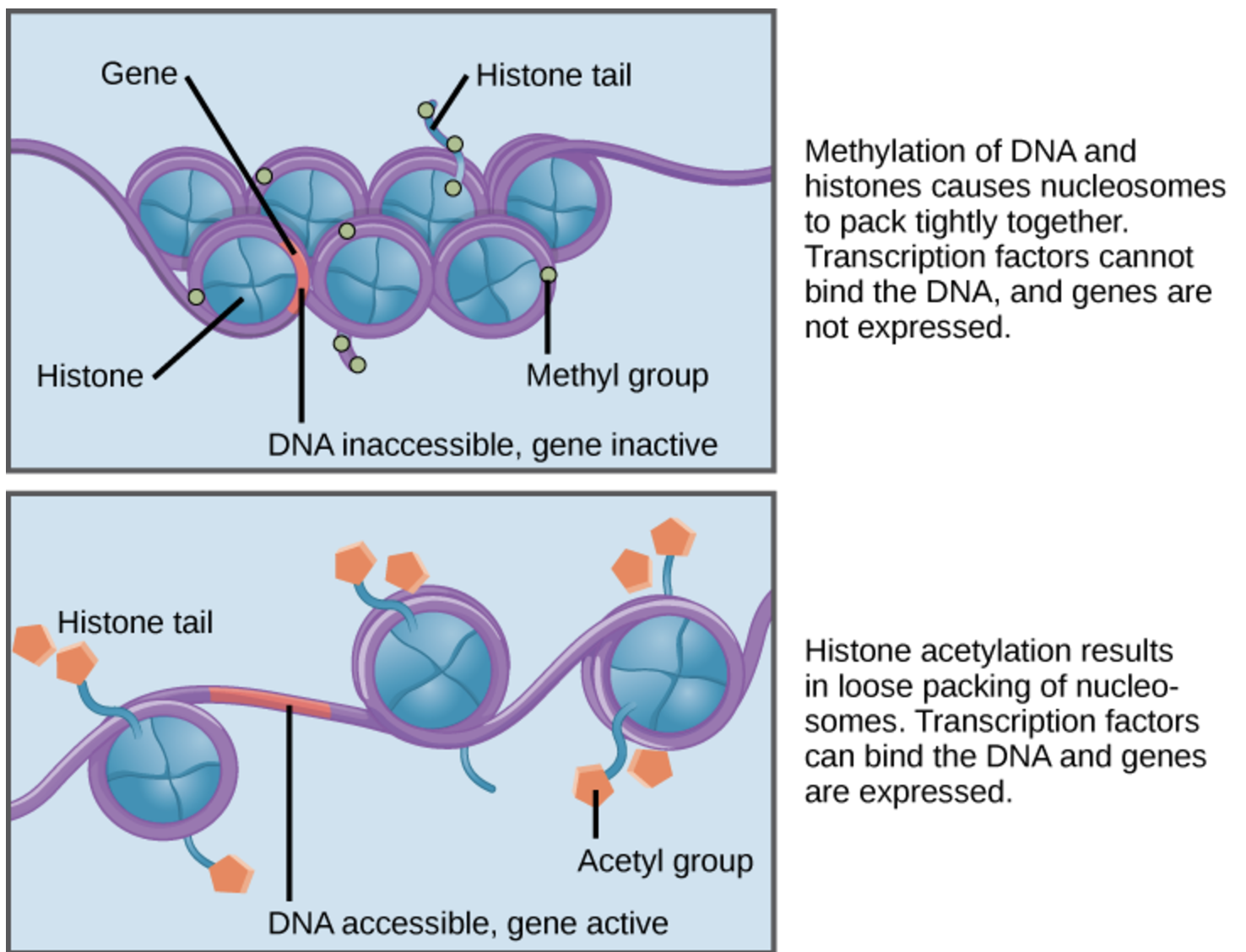
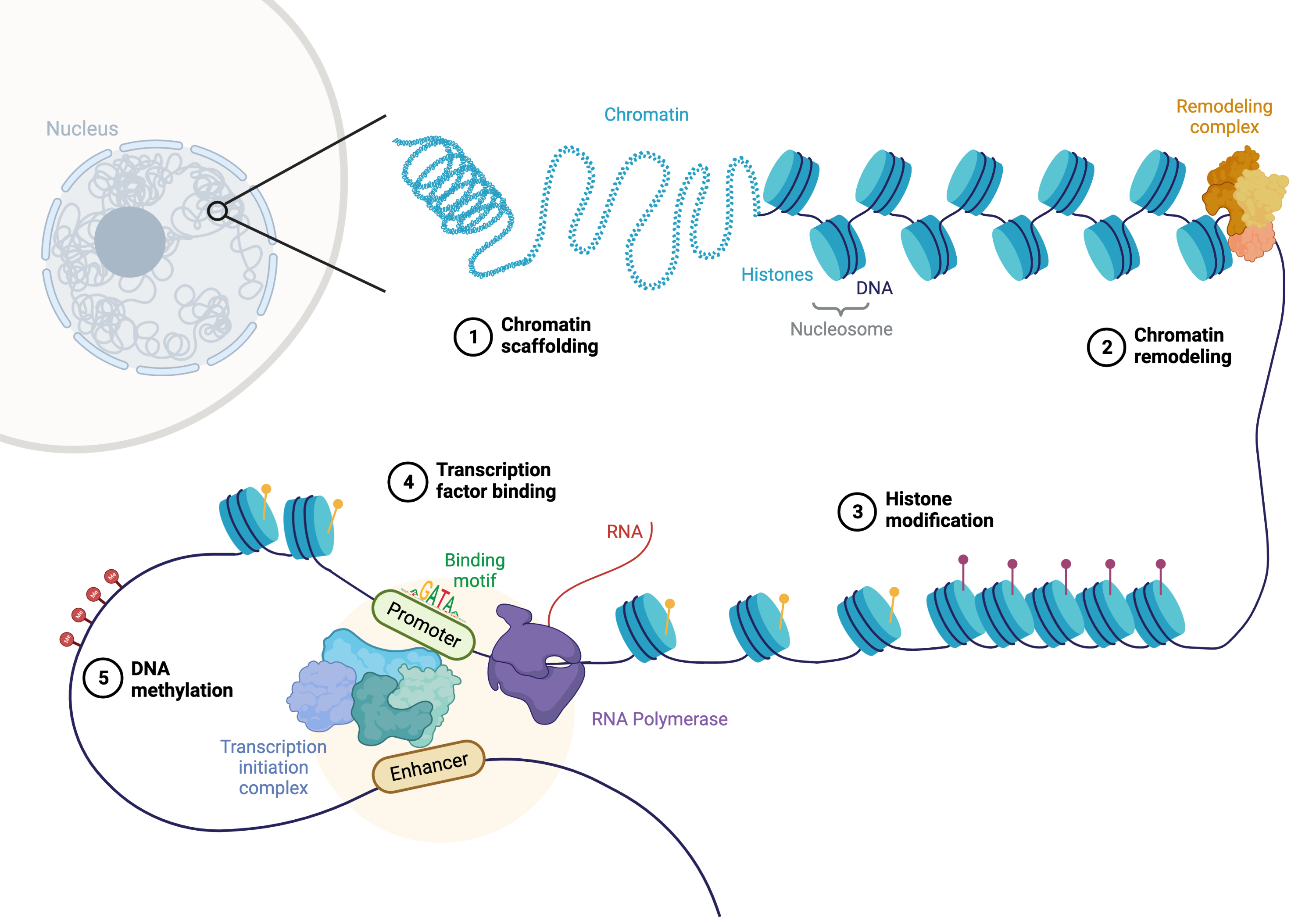
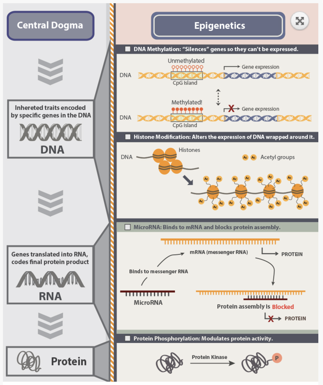
The genome is the complete set of DNA within an organism, encoding the instructions for life. While every cell in an organism typically contains the same genome, different cells exhibit distinct phenotypes and functions. This diversity arises not from changes in the underlying DNA sequence but from epigenetic regulation—heritable modifications that influence gene expression without altering the DNA itself. Epigenetics includes processes like DNA methylation, histone modification, and chromatin accessibility, all of which contribute to the dynamic regulation of gene activity in response to developmental cues and environmental signals.
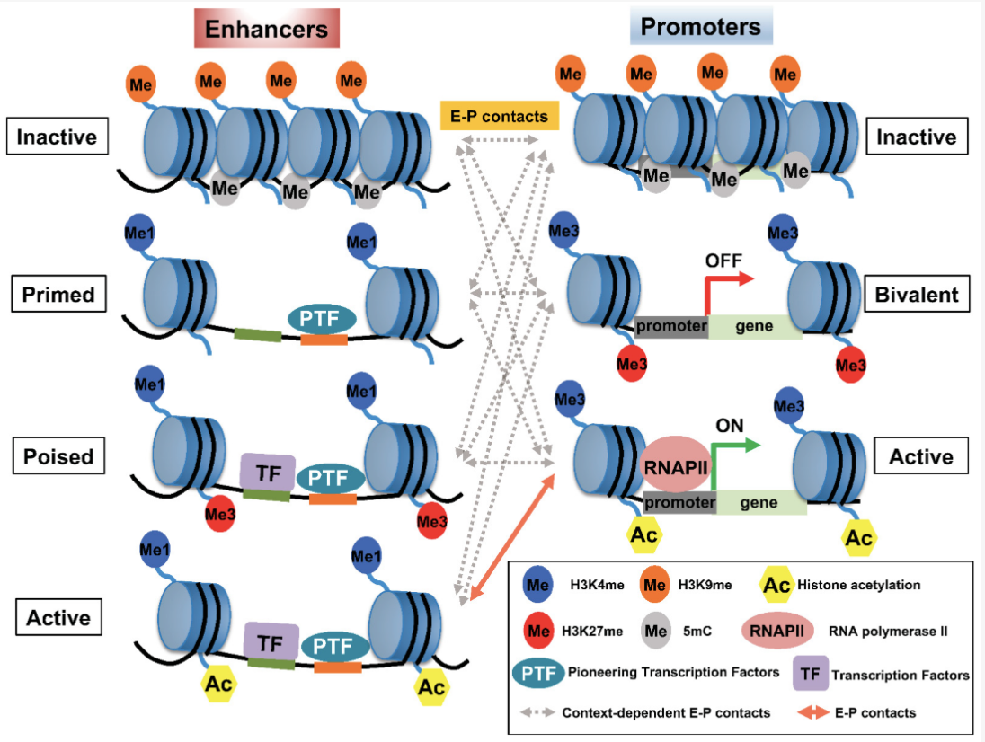
Enhancers play a critical role in this regulatory landscape. These are DNA sequences that, while not coding for proteins themselves, can dramatically increase the transcription of target genes. Enhancers act by binding specific transcription factors, proteins that recognize and attach to DNA sequences to regulate gene expression. Some transcription factors require assistance from chaperone proteins, which ensure their proper folding and functionality, or pioneer proteins, which can access and open tightly packed chromatin to allow other factors to bind. This interplay highlights the complexity of the regulatory machinery that governs cellular function. See Figure 6.1 and Figure 6.2 to appreciate how complex this machinery is.
6.2 The zoo of epigenetic modalities
Epigenetics encompasses a vast array of molecular mechanisms that regulate gene expression without altering the underlying DNA sequence. These mechanisms include modifications to DNA, RNA, chromatin, and the spatial organization of the genome, collectively forming a complex regulatory landscape. Below are some of the key modalities studied in epigenetics:
DNA Accessibility: Techniques like ATAC-seq and DNase-seq measure how accessible DNA is to transcription factors and other regulatory proteins. Accessible regions often overlap with promoters and enhancers, providing critical insights into gene regulation. (This is what we’ll focus on this chapter.)
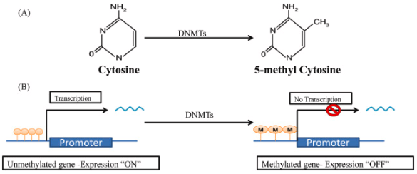
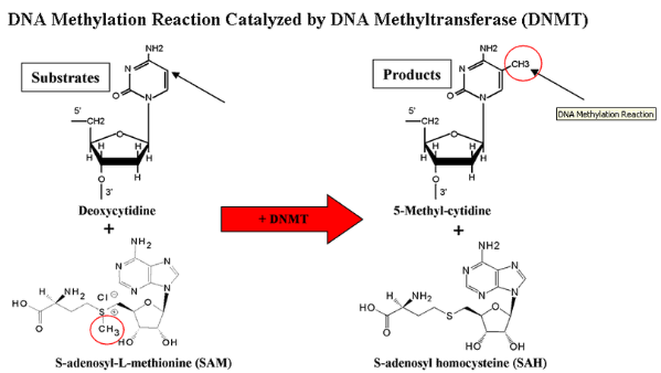
DNA Methylation1: This modification, typically at cytosines in CpG dinucleotides, is a key epigenetic mark associated with gene silencing. Tools like bisulfite sequencing are used to map methylation patterns across the genome, revealing their roles in development and disease. See Figure 6.3 and Figure 6.4.
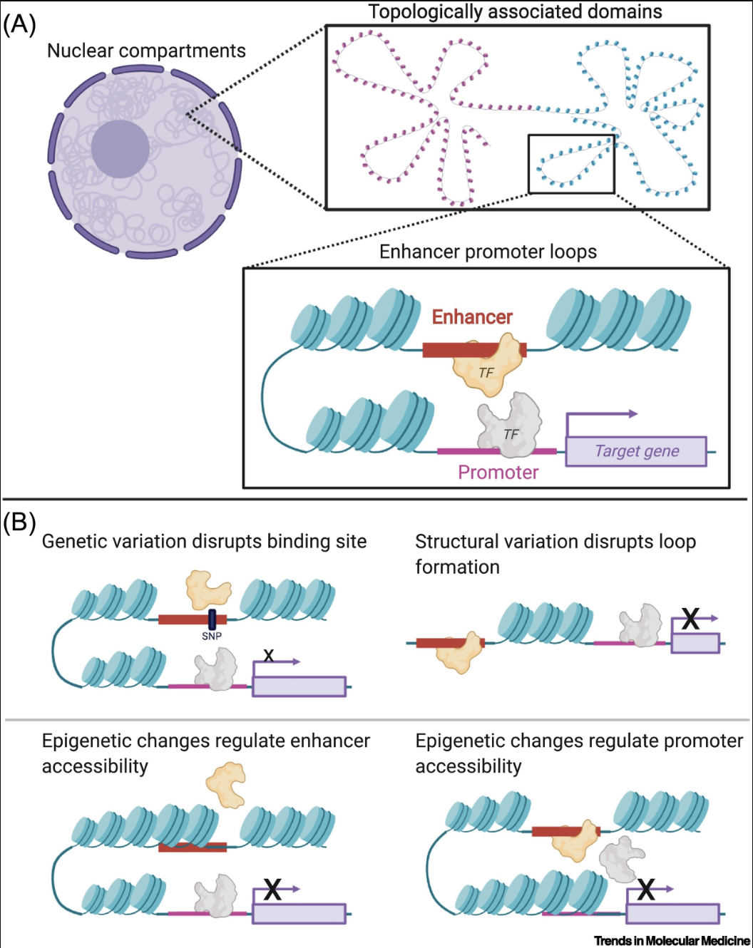
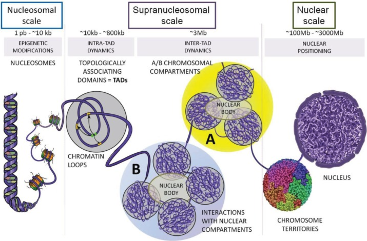
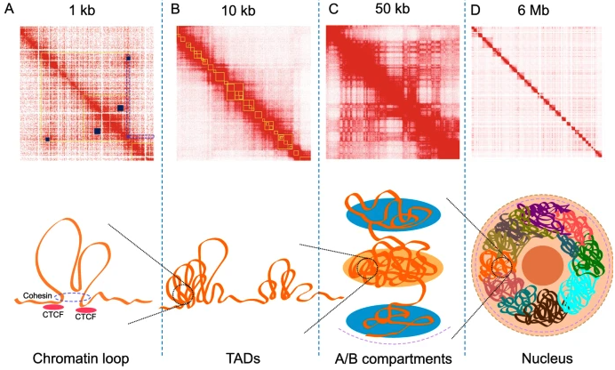
- Hi-C and Genome Organization2: Hi-C measures chromatin interactions to reveal the three-dimensional structure of the genome. It uncovers features like topologically associating domains (TADs) and enhancer-promoter loops, which are crucial for understanding how spatial organization influences gene regulation. See Figure 6.5 and Figure 6.6.
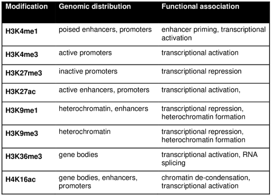
- Histone Modifications3: Post-translational modifications, such as acetylation, methylation, and phosphorylation, occur on histone proteins and regulate chromatin structure. Techniques like ChIP-seq and the newer Cut & Tag method are used to map these modifications and their role in gene expression at the bulk level. See Figure 6.7 and Figure 6.8.
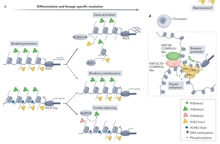
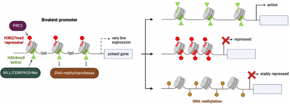
Some of you might be interested: Personally, I think one of the fascinating concepts based on histone modifications is bivalent chromatin (essentially, chromatin that is wrapped in such a way that is simultaneously activated and silenced), see Figure 6.9 and Figure 6.10. It’s a particularly curious phenomenon that entire labs dedicate themselves to studying. See Blanco et al. (2020) for an overview why this mechanism might be “beneficial.”
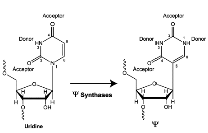
- RNA Modifications (m6A and Pseudouridine): Modifications like N6-methyladenosine (m6A) and pseudouridine occur on RNA molecules and are involved in processes like splicing, translation, and mRNA decay. See Figure 6.11 for what pseudouridine is, i.e., “a rotation of the uridine molecule.” These modifications add an epitranscriptomic layer to gene regulation.
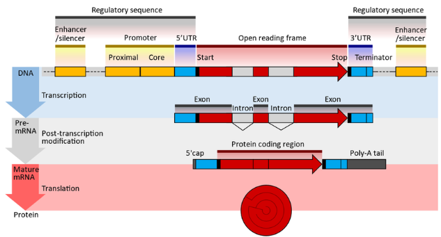
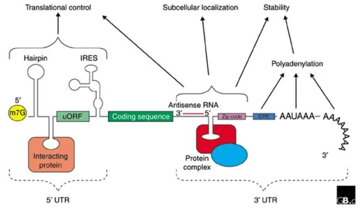
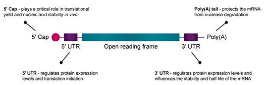
- Untranslated Regions (UTRs): Before talking about UTRs, it’s probably good to review what an mRNA fragment “looks like” at the different stages of transcription and translation, see Figure 6.12. The 5′ and 3′ UTRs contain regulatory elements that influence mRNA stability, localization, and translation efficiency. The 3′ UTR, in particular, serves as a binding platform for RNA-binding proteins and microRNAs, providing an additional layer of post-transcriptional gene regulation (Figure 6.13 and Figure 6.14).
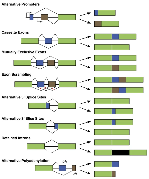
- Alternative Splicing: This post-transcriptional process generates multiple mRNA isoforms from the same gene, expanding the proteomic diversity, see Figure 6.15. This is a combinatorial explosion of isoforms. While not traditionally classified as epigenetic, splicing often intersects with chromatin modifications and RNA-binding proteins, blurring the lines between transcriptional and post-transcriptional regulation.
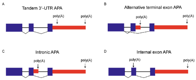
- Alternative Polyadenylation (APA): APA generates transcript isoforms with different 3′ ends, affecting mRNA stability, localization, and translation, see Figure 6.16. By selecting distinct cleavage sites, APA alters the 3′ UTR length without affecting the poly-A tail itself, thereby modulating interactions with regulatory factors such as microRNAs and RNA-binding proteins.
Efforts like the ENCODE project (https://pmc.ncbi.nlm.nih.gov/articles/PMC7061942/) have systematically mapped these modalities across cell types and tissues, creating a comprehensive resource for understanding genome function. ENCODE has provided invaluable datasets on DNA accessibility, histone modifications, and RNA-binding proteins, enabling researchers to uncover how epigenetic and transcriptomic layers work together to drive cellular processes.
Finally, tools like MPRA (Massively Parallel Reporter Assays) are revolutionizing how we study enhancers and regulatory sequences. MPRA allows researchers to test thousands of DNA fragments for their regulatory activity, providing functional validation for epigenetic marks. This growing zoo of modalities continues to expand our understanding of how the genome is dynamically regulated in health and disease.
See Figure 6.17 and Figure 6.18 for some courageous figures that try to display multiple types of epigenetic modifications all at once. See Lim et al. (2024) for a broad overview about the different types of technologies to sequence different omics and layers of epigenetics, and how they are getting computationally put together.
Some videos to look at for fun
- “Why human brain cells grow so slowly” (Nature videos): https://www.youtube.com/watch?v=lIJkc6tulus
- “What is epigenetics? - Carlos Guerrero-Bosagna” (TED-Ed): https://www.youtube.com/watch?v=_aAhcNjmvhc
6.3 Glossary of terms that’ll be useful throughout this chapter
- Chromatin: The complex of DNA and histone proteins that packages the genome, regulating accessibility for transcription factors and other regulatory elements.
- Histone: A protein that DNA wraps around to form nucleosomes, playing a key role in chromatin structure and epigenetic regulation through modifications such as methylation and acetylation. Eight histone proteins can come together to make up something called a nucleosome.
- Enhancer: A DNA region that enhances gene transcription, often located far from the transcription start site (TSS), and accessible in open chromatin regions detected by ATAC-seq.
- Promoter: A regulatory DNA region typically located upstream of a gene’s TSS, where RNA polymerase and transcription factors bind to initiate transcription.
- Transcription Start Site (TSS): The location where RNA polymerase begins transcribing a gene, often marked by open chromatin and specific histone modifications.
- Intron/Exon: Exons are coding regions of a gene included in the mature mRNA, while introns are non-coding regions removed during splicing.
- Spliced/Unspliced mRNA: Spliced mRNA has undergone intron removal and is ready for translation, while unspliced mRNA still contains introns and provides insights into transcriptional dynamics in single-cell RNA-seq.
- Peak: A region of open chromatin identified in data such as ATAC-seq or ChIP-seq experiments, corresponding to accessible regulatory elements such as promoters and enhancers.
- Motif: A short, recurring DNA sequence recognized by transcription factors, often enriched in ATAC-seq peaks to infer regulatory activity.
- Transcription Factor: A protein that binds to DNA motifs to regulate gene expression, often influencing cell state and identity.
- Pioneer Factor: A specialized transcription factor capable of binding closed chromatin and initiating chromatin remodeling to make DNA accessible for transcription.
6.4 10x Multiome – Joint profiling of chromatin accessibility and RNA
The 10x Multiome allows researchers to simultaneously profile gene expression (RNA) and chromatin accessibility (ATAC) at the single-cell level. This provides a comprehensive view of transcriptional and regulatory states within the same cells, enabling deeper insights into gene regulation and cell type characterization.
6.4.1 Primer on chromatin accessibility and “peaks”
Chromatin accessibility refers to the degree to which DNA is physically accessible to regulatory proteins such as transcription factors, RNA polymerase, and other elements of the transcriptional machinery. In eukaryotic cells, DNA is wrapped around histone proteins to form chromatin, which can exist in a closed or open state. Open chromatin regions are more likely to contain active regulatory elements such as promoters and enhancers, while closed chromatin regions are generally associated with transcriptional repression. Profiling chromatin accessibility provides insights into which regulatory elements are active in a given cell state, offering a complementary perspective to RNA-seq data.
In single-cell ATAC-seq experiments, accessible chromatin regions are identified as peaks, which represent DNA regions where the transposase enzyme preferentially inserts sequencing adapters. These peaks correspond to genomic loci where nucleosomes are absent or displaced, indicating active regulatory sites. Peaks are typically mapped to gene promoters, enhancers, or other functional elements to infer regulatory activity. By integrating chromatin accessibility with gene expression data from the same cells, 10x Multiome enables researchers to connect regulatory regions with their target genes, uncovering how chromatin structure influences transcriptional programs and cell fate decisions.
The resulting data often looks like Figure 6.19, where, for each genomic region, you can define “peaks” where there are regions of accessible DNA.

6.4.2 Brief description of the technology
The following are the high-level steps involved in performing single-cell multiome sequencing using the 10x Genomics Multiome ATAC + Gene Expression platform:


- Tissue Dissociation and Cell Isolation:
Tissues are dissociated into a single-cell suspension using enzymatic or mechanical methods. Cells are isolated via fluorescence-activated cell sorting (FACS) or other methods to ensure viable, intact cells for profiling both RNA and chromatin. - Transposition and RNA Capture:
Cells are incubated with a transposase enzyme that fragments DNA in open chromatin regions and tags them with sequencing adapters. Simultaneously, RNA is captured via hybridization to barcoded beads containing poly(dT) sequences, enabling downstream transcriptomic profiling. - Droplet Generation:
Using the 10x Chromium instrument, individual cells are encapsulated into oil-based droplets along with barcoded gel beads. Each bead contains unique barcodes for both RNA and chromatin, ensuring that data from both modalities are linked to the same cell. - Reverse Transcription and Transposition Amplification:
RNA is reverse-transcribed into complementary DNA (cDNA) within the droplets. Transposed DNA fragments are amplified via PCR to enrich for regions of open chromatin. - Droplet Breakage and Cleanup:
Droplets are broken, and the barcoded nucleic acids are recovered. Separate workflows are used to process RNA-derived cDNA and transposed DNA fragments. - Library Preparation:
The cDNA and DNA libraries are prepared in parallel:- RNA Library: Includes additional steps for amplification and adapter ligation to finalize the gene expression library.
- ATAC Library: Focuses on chromatin accessibility, with library preparation steps optimized for sequencing transposed DNA.
- High-Throughput Sequencing:
The prepared RNA and ATAC libraries are sequenced on an Illumina platform, typically with paired-end reads to capture both transcriptomic and chromatin information. - Data Alignment and Integration:
Sequencing reads are mapped to the genome, with RNA reads assigned to transcripts and ATAC reads aligned to open chromatin regions. Barcode information is used to link the RNA and chromatin profiles back to individual cells, enabling multi-modal analyses.
Brief note about peak-calling.
Peak-calling is the computational process of identifying regions of open chromatin from ATAC-seq data, where transposase insertion events are enriched. These peaks represent accessible regulatory elements such as promoters, enhancers, and transcription factor binding sites. Peak-calling algorithms, such as MACS2 or the cellranger-atac pipeline (see Figure 6.22), detect significant enrichments in sequencing reads while accounting for background noise and sequencing biases. In single-cell ATAC-seq, peak-calling is often performed at the population level or adapted to sparse single-cell data by aggregating similar cells. Accurate peak-calling is essential for interpreting chromatin accessibility patterns and linking regulatory regions to gene expression.

Further reading.
See Mansisidor and Risca (2022), Miao et al. (2021), Teichmann and Efremova (2020) for an in-depth dive on the biological insights from this omic (among many, many review papers). Two things are of note: 1) modeling scATAC-seq data is not as straight-forward as scRNA-seq (see Miao and Kim (2024), Martens et al. (2024)), 2) almost all the scRNA-seq methods we have discussed in Chapter 2 and Chapter 3 have a counterpart developed specifically to model scATAC-seq data. For example, peakVI Ashuach et al. (2022) is a commonly used method to compute the low-dimensional embedding for scATAC-seq data.
6.5 ChromVAR: The most commonly used method to assess binding regions
ChromVAR (short for Chromatin Variability Across Regions, Schep et al. (2017)) is a computational tool designed to analyze chromatin accessibility data, such as those generated from ATAC-seq or single-cell ATAC-seq experiments. Its primary goal is to quantify variability in chromatin accessibility across predefined genomic regions, such as transcription factor binding motifs or enhancers, and link these patterns to regulatory factors that drive cell state differences.
What the heck is a motif? A motif is a short, recurring DNA sequence pattern that is recognized and bound by specific transcription factors (TFs) to regulate gene expression, see Figure 6.23. These motifs are typically found in promoters, enhancers, and other regulatory regions of the genome. Motifs are often represented as position weight matrices (PWMs), which describe the probability of observing each nucleotide (A, T, C, G) at a given position in the sequence. Identifying motif enrichment in chromatin accessibility data helps infer which transcription factors are active in a given cell type or condition. ChromVAR leverages these motifs to assess whether specific transcription factors are driving chromatin accessibility changes, providing insights into cell-type-specific regulatory programs.

Sidenote about motifs. If you work on scATAC-seq or ChIP-seq data long enough, you’ll eventually need to learn about: 1) how to detect potential binding sites in your data, and 2) how to find a database of “known” motifs. For the first point, HOMER Heinz et al. (2010) is a very common bioinformatics tool. It takes in a bunch of DNA regions, and then finds DNA motifs that are significantly enriched as well as which potential TF might match those motifs, see Figure 6.24. For the second point, JASPAR is one of the more common databases of TFs, see https://jaspar.elixir.no/ and Fornes et al. (2020). In R, the Bioconductor package is called JASPAR2020.

Details of ChromVAR. ChromVAR works by computing deviation scores, which measure how much the accessibility of a given set of regions (e.g., those containing a specific transcription factor motif) varies across cells or samples. This enables the identification of transcription factors that are likely active and driving regulatory differences within the dataset. See Figure 6.25.
Input/Output. The input for a ChromVAR analysis is: 1) \(\in \mathbb{Z}_{+}^{n \times p}\) for the \(n\) cells and \(p\) peaks, 2) the specific locations of the \(p\) peaks along the reference genome (for example, in humans, this could be the hg38 reference genome, and in R, this is typically managed by the GenomicRanges BioConductor package, and 3) a database of TF motifs, such as JASPAR. (*Technically*), you don’t actually pass Item #2 or #3 as input. ChromVAR already expects you to have matched peaks to motifs using some method, for instance, motifmatchr. This matching is where, technically, Item #2 and #3 are used.) The output is then a new matrix \(Y \in \mathbb{R}^{n\times d}\) where \(d\) is the number of TFs, and entry \(Y_{ij}\) denotes the excess variability of the TF \(j\)’s accessibility in cell \(i\), relative to a set of “background” DNA regions that have similar qualities as TF \(j\).
Here’s how it works:
- Input Data: The input consists of a binary peak-by-cell matrix (e.g., from single-cell ATAC-seq), where each entry indicates whether a specific genomic region (peak) is accessible in a given cell. A set of motif annotations (e.g., binding motifs for transcription factors) is provided to group peaks into motif-associated sets.
Importantly: To run ChromVAR, you must have a reference genome. You are about to scan the genome for locations where a motif can bind to a particular DNA sequence in the reference genome. That is, you’re thinking about the specific base pair sequence of the DNA.
- Region Set Aggregation: Peaks are grouped into sets based on the motifs. For each cell \(i\) and each motif-associated region set \(k\), ChromVAR computes the aggregate accessibility:
\[ A_{ik} = \sum_{j \in S_k} X_{ij}, \]
where \(S_k\) is the set of peaks \(j\)’s associated with motif \(k\).
In simple terms, you’re adding up all the peaks that contain a relevant motif.) This sum (for cell \(i\)) is normalized against all other cells (i.e., across all cells, how many counts were mapped to these peaks.
Sampling a set of background peaks: One of ChromVAR’s most important steps is carefully choosing a set of “background peaks,” i.e., peaks that are not the ones associated with motif \(k\), but have similar biological qualities. ChromVAR typically controls for two important things to do this: the GC content of a peak region and the region’s fragment length. (GC content is adjusted for since PCR tends to favor GC-rich regions.) Then, for every peak that contains motif \(k\), it samples many different peaks that has similar GC content and fragment length to the particular peak. This loops over all the peaks associated with motif \(k\), and the aggregate set of sampled peak is called the set of background peaks.
Deviation Scores: The deviation score quantifies how much the accessibility for a motif-associated region set deviates from what is expected under a background distribution. ChromVAR uses a binomial model to compute the expected accessibility, and the deviation score \(D_{kj}\) is defined as the z-score:
\[ Y_{ik} = \frac{A_{ik} - \mathbb{E}[A_{ik}]}{\text{SD}[A_{ik}]}, \]
where \(\mathbb{E}[A_{ik}]\) and \(\text{SD}[A_{ik}]\) are the expected mean and standard deviation of the accessibility for motif \(k\) under the background model. This matrix \(Y\) (over all the cells and all motifs) is the output.

6.6 Deep-learning integration and translation of RNA and ATAC
Single-cell multi-omic data integration is challenging due to the lack of one-to-one correspondence between cells across different assays. While many experimental technologies allow simultaneous measurement of multiple omics modalities (e.g., RNA and chromatin accessibility), most single-cell datasets include only one modality. This creates the challenge of integrating data from different omics layers with distinct feature spaces (e.g., genes in scRNA-seq vs. chromatin regions in scATAC-seq). We call this diagonal integration since we simultaneously have different cells in each dataset and different features (since these are two different omics). See Figure 6.26.
Our goal can be thought of as one of two things (which are essentially equivalent):
Matching: How do we match a cell in the first omic to the “best” corresponding cell in the second omic, so we can “pretend” we were able able to sequence paired multi-omic data?
Imputation of missing omics: For the cells where we only sequenced the first omic, can we predict what the expressions of these cells would had been if we sequenced the second omic? And vice versa, can we predict the first omic for the cells where we only sequenced the second omic?
Upon first glance, it seems surprising that anyone can do you anything at all.

6.6.1 Strategy 1: Completely unsupervised approach to diagonal integration
In the first broad category we’ll talk about here, we seek to diagonally integrate \(X \in \mathbb{R}^{n_x \times p_x}\) and \(Y \in \mathbb{R}^{n_y \times p_y}\), two single-cell datasets on different omics (i.e., the \(p_x\) features in the first omic are different from the \(p_y\) features in the second omic). Here, we are not willing to make any biological assumptions on how these two omics are related.
A typical choice: SCOT.
SCOT (Single-Cell alignment with Optimal Transport) addresses diagonal integration using the Gromov-Wasserstein optimal transport framework Demetci et al. (2022). The key idea is to align datasets from different modalities while preserving their intrinsic geometric structures. SCOT constructs \(k\)-nearest neighbor (k-NN) graphs for each dataset and computes intra-domain pairwise distance matrices. The alignment is achieved by finding a probabilistic coupling matrix \(\mathbf{G}\) that minimizes the discrepancy between these intra-domain distances.
Input/Output. The inputs to SCOT are: 1) 2 different single-cell datasets \(X \in \mathbb{R}^{n_x \times p_x}\) and \(Y \in \mathbb{R}^{n_y \times p_y}\), each measuring a different omic (i.e., different features) on a different set of cells. The primary output is a matching between (not necessarily 1-to-1) cells in \(X\) and \(Y\) so you computationally pretend you have paired multi-omic data for your downstream procedures.
Brief aside on Wasserstein distance: The Wasserstein distance, rooted in optimal transport theory, measures the effort required to morph one probability distribution into another. This can be intuitively understood using the “moving pile of sand” analogy: given two distributions, we seek the most efficient way to move mass from one distribution to another while minimizing transportation cost.
Mathematically, given two discrete distributions \(\mu = \sum_{i=1}^{n} p_i \delta_{x_i}\) and \(\nu = \sum_{j=1}^{m} q_j \delta_{y_j}\), the classic optimal transport problem finds a coupling matrix \(\mathbf{G} \in \mathbb{R}^{n \times m}\) that minimizes the transport cost:
\[ W_c(\mu, \nu) = \min_{\mathbf{G} \in \Pi(\mu, \nu)} \sum_{i=1}^{n} \sum_{j=1}^{m} c(x_i, y_j) G_{ij}, \]
where \(c(x_i, y_j)\) represents the cost of moving mass from \(x_i\) to \(y_j\), and \(\Pi(\mu, \nu)\) is the set of all valid transport plans satisfying the marginal constraints:
\[ \sum_{j=1}^{m} G_{ij} = p_i, \quad \sum_{i=1}^{n} G_{ij} = q_j, \quad G_{ij} \geq 0. \]
The Gromov-Wasserstein (GW) distance uses optimal transport by aligning the pairwise distances of cell with each omic. Given distance matrices \(\mathbf{D}^{X}\) and \(\mathbf{D}^{Y}\) for datasets \(X\) and \(Y\) (one for each omic), the GW problem is
\[ \operatorname{GW}(\mu, \nu) = \min_{\mathbf{G} \in \Pi(\mu, \nu)} \sum_{i,k} \sum_{j,l} L(D^X_{ik}, D^Y_{jl}) G_{ij} G_{kl}, \]
where \(L(D^X_{ik}, D^Y_{jl})\) quantifies how much the transport plan distorts local geometric structures. SCOT uses this framework to learn an alignment between single-cell datasets by computing the optimal \(\mathbf{G}\), followed by a barycentric projection to bring the datasets into a common space.

A simple analogy: To understand SCOT, consider the following analogy. Let’s say in the first omic, we measured 4 cells: {A, B, C, D}, where we infer that cell-pairs {A,B}, {B,C}, and {A,D} are similar (based on their expression profiles in the first omic). In the second omic, we measured 4 cells: {I, II, III, IV}, where we infer that cell-pairs {II,IV}, {IV,III}, and {II,I} are similar (based on their expression profiles in the second omic). From this, we can infer that a reasonable matching is, {A, II}, {B, IV}, {C, III}, and {D,I}. You can imagine that the Wasserstein framework is apply this logic much more formally and robustly.
A brief note on other approaches.
You’re really driving in the dark with these approaches since you’re blindly trusting that both omics have to stem “from the same manifold,” loosely speaking. This flavor of diagonal integration essentially boils down to manifold alignment – how can you “align” two different omics, where you trust that this computation alignment tells you how the two omics are aligned. (However, for certain pairs of omics, you really have no other choice, so this comment isn’t necessarily a criticism. It is more of a cautionary warning for you to think carefully on how would you even know you had a sensible integration.) A common addition in recent years for these diagonal integration methods is not to require all cells to be matched, see K. Cao, Hong, and Wan (2022). This addition complicates the computation, but enables you to allow for biological signal in one omic that is not recapitulated in the other. See Xu and McCord (2022) for more commentary.
6.6.2 Strategy 2: Leveraging more biological information for diagonal integration
Unlike the methods in Section 6.6.1, what if you do have biological insights about how the two omics are related? Then certainly, you should be able to perform a much more powerful diagonal integration if your biological insights are correct.
A typical choice: GLUE.
Graph-Linked Unified Embedding (GLUE), as the name suggests, everages prior biological knowledge to construct a guidance graph, where nodes represent features (e.g., genes or ATAC peaks) and edges represent regulatory interactions (e.g., enhancer-promoter links) Z.-J. Cao and Gao (2022). This graph links omics-specific feature spaces, enabling joint learning of regulatory relationships and cell embeddings. By combining the guidance graph with observed data, GLUE infers regulatory interactions in a Bayesian-like manner. This enables the identification of cis-regulatory relationships, such as enhancer-gene links, and provides insights into transcription factor (TF) activity.
Input/Output. The inputs to GLUE are: 1) \(K\) different single-cell datasets \(X^{(k)} \in \mathbb{R}^{n_k \times p_k}\) for each \(k \in \{1,\ldots,K\}\), each measuring a different omic (i.e., different features) on a different set of cells, and 2) a graph \(\mathcal{G}\) that connects the \({p_k}_{k=1}^{K}\). (This is the guidance graph, and this gets treated as another “dataset” in some sense.) The primary output is \(\hat{X}^{(k_1;k_2)} \in \mathbb{R}^{n_{k_1} \times p_{k_2}}\). That is, this is the “best guess” of expression in the \((k_2)\)-th omic for the cells in \((k_1)\)-th omic.
Importantly, separate variational autoencoders (VAEs) are trained for each omics layer, producing omics-specific low-dimensional cell embeddings. A shared latent embedding is aligned across modalities through adversarial learning and guided by the regulatory graph.
Some of the modeling details:
- Guidance Graph: Let \(p=\sum_{k=1}^{K}p_k\), which denotes the total number of features across all \(K\) omics. The guidance graph \(\mathcal{G} = (\mathcal{V}, \mathcal{E})\) connects features across omics layers, with edges weighted by interaction confidence, where \(\mathcal{V}\) denotes all \(p\) features. The feature embeddings \(V\) are learned to reconstruct this graph, roughly:
\[ \log p(\mathcal{G} | V) = \sum_{(i, j) \in \mathcal{E} } \big[\log \sigma(s_{ij} v_i^\top v_j) + \sum_{j' : (i,j') \notin \mathcal{E}} \log\big(1-\sigma(s_{ij'}v_i^\top v_{j'}\big)\big], \]
where \(\sigma\) is the sigmoid function, \(s_{ij}\) indicates edge polarity, and \(v_i, v_j\) are feature embeddings. We’ll need to learn the graph convolution network encoder to learn \(V\) from \(\mathcal{G}\) (please see the paper for this – this is a bit complicated to explain concisely), as well as the parameters \(\{s_{ij}\}_{i,j\in\{1,\ldots,p\}}\) (which is the “decoder” for the graph, in a sense).
This \(V\) is a matrix with number of rows equal to the total number of features in \(\mathcal{G}\), and the number of columns equal to the latent dimension. We can subset the rows specific to the \(k\)-th omic to get the matrix (with less rows) \(V^{(k)}\).
- Autoencoder for Cell Embeddings: Each omics layer \(k\) has its own autoencoder that generates cell embeddings \(U\) from observed data \(X^{(k)}\):
\[ p_{\text{decoder }k}(x^{(k)}_i | u_i, V^{(k)}) = \text{NB}(x^{(k)}_i; \text{mean vector}, \text{dispersion vector}), \]
where \(\text{NB}\) is a negative binomial distribution for modeling count data. Here, \(U\) is the “common” embedding across any of the \(K\) omics. (I’m using the notation \(x^{(k)}_i\) to denote the the \(i\)th cell in the \(k\)-th omic, which is a row in \(X^{(k)}\) – I apologize for this confusion notation, there’s a lot of things flying around.) Importantly, this “decoder” takes in the cell embedding \(U\) and the latent embeddings for all the features for the \(k\)-th omic, \(V^{(k)}\). This is accompanied by a encoder for each omic to yield its posterior Gaussian distribution,
\[ q_{\text{encoder }k}(u_i | x^{(k)}_i) = \text{N}(\text{some mean}, \text{some covariance}). \]
We’ll also need to train all \(K\) encoders and “decoders”.
The important formula to see how this works is the Equation (9) in the paper, which, in the notation in the notes here, would be,
\[ \begin{aligned} &\big\{\text{The imputed expected expression of feature $j$ in omic $k$}\big\} = \\ &\big\{\text{The $j$-th coordiate of: SoftMax}\Big(\alpha \odot (V^{(k)})^\top u_i+ \beta \Big)\big\} \cdot \\ &\big\{\text{Observed library size of the cell in omic $k$}\big\}. \end{aligned} \]
where \(\odot\) denotes the Hadamard product4, (i.e., entry-wise product). Note: 1) \(V^{(k)}\) is a matrix that has rows equal to the number of features in the \(k\)-th omic, and columns equal to the latent dimension. \(u_i\) is a vector of length equal to the number of latent dimensions. Therefore, \((V^{(k)})^\top u_i\) is a vector of length equal to the number of features in the \(k\)-th omic. 2) This isn’t the decoder you might be familiar with hidden layers of linear transformations followed by activation functions. Instead, this is more-or-less a straightforward linear transformation that takes the feature embeddings and cell embeddings5.
- Adversarial Alignment: A discriminator \(D\) is trained to classify omics layers based on cell embeddings \(u\). Encoders are updated to fool the discriminator, aligning embeddings across modalities:
\[ - \sum_k \mathbb{E}_{X^{(K)}} \left[ \log D_k(\text{discriminator}(U)) \right], \]
where \(D_k\) is the the multiclass classification cross entropy, and the discriminator is a function that is being adversarially trained to try to distinguish between the \(K\) omics. The data encoders can then be trained in the opposite direction to fool the discriminator, ultimately leading to the alignment of cell embeddings from different omics layers.
- Overall Objective: The total loss combines data reconstruction, graph reconstruction, and adversarial alignment. That is, the discriminator is training to minimize
Error when predicting which omic the input data came from based on the embedding \(U\), while, simultaneously, the encoders and decoders are trying to maximize
\[ \begin{aligned} &\lambda_{\mathcal{G}} \cdot \text{Log-likelihood of generating graph $\mathcal{G}$ based on feature embedding }V +\\ &\lambda_{D} \cdot \text{The confusion of discriminator $D$ predicting the omic based on }U +\\ &\Big[\sum_{k=1}^{K}\text{Log-likelihood of generating data from omic $k$ based on } U \text{ and }V\Big], \end{aligned} \]
where \(\lambda_{\mathcal{G}}\) and \(\lambda_{D}\) are hyperparameters.

Conceptually: 1) The adversarial discriminatory is working “against” you, and trying to predict if a cell’s embedding comes from one omic or the other. The better the adversary can do this, the more it means that you (GLUE) did not yet properly align the two omics. 2) The guidance graph is (at a high level) about orienting this alignment. As opposed to unsupervised integration methods that purely rely on geometric relations, GLUE uses this guidance graph to help determine, “If there are multiple ‘rotations’ of the omics to align them, which particular ‘rotation’ makes the most sense?”
A brief note on other approaches.
There are fewer methods in this category, and these methods are a lot harder for a third-party to benchmark since they heavily rely on the biological information you’re using. However, for some examples, integrating single-cell RNA and proteins, you can look at B. Zhu et al. (2021), S. Chen et al. (2024). For single-cell RNA and ATAC, you can look at Z. Zhang, Yang, and Zhang (2022) in addition to GLUE.
6.6.3 Don’t forget about all the usual multi-modal integration methods!
Don’t forget that, similar to how there’s a TotalVI for CITE-seq data, there are a lot of vertical integration methods for RNA-ATAC multiome data. See the end of Section 5.6.1 for some benchmarking papers. I’ve seen a couple more often than others: WNN Hao et al. (2021) and MultiVI Ashuach et al. (2023) (see Figure 6.29, a deep-learning method).

Translation between omics.
A related task in paired multiome data is: given the RNA profile, can we use translate this into the ATAC profile, and vice versa? At a high level, this is not too different from using an integration of paired multiome data. You simply use one omic’s encoder, and then another omic’s decoder. There are some important engineering differences to facilitate this idea. You can see Polarbear (R. Zhang et al. (2022), see Figure 6.30) and BABEL Wu et al. (2021) for examples.

Returning back to the idea of “union” or “intersection” of information in Remark 5.3, the ability to translate from one omic to another necessarily means you are conceptually more focused on learning the “intersection” of information.
Mosaic integration.
What if you have many omics across many datasets, and some of your datasets are paired? We usually call this mosaic integration, where we essentially are “putting the mosaic together” using puzzle pieces of different datasets. In this task, we often have some mixture of paired multiome datasets and some single-omic datasets. See Figure 6.31 for an example. Two methods to look at as an example of this are scMoMaT Z. Zhang et al. (2023) and Cobalt Gong, Zhou, and Purdom (2021).

6.7 Brief aside: Transcription factors
Transcription factors (TFs) are proteins that regulate gene expression by binding to specific DNA sequences, often within promoters or enhancers, to activate or repress transcription, see Figure 6.32. They play a crucial role in controlling cellular identity, development, and response to environmental signals. TFs recognize distinct motifs, short DNA sequence patterns, and their binding can be influenced by chromatin accessibility, co-factors, and post-translational modifications. Some TFs act as pioneer factors, capable of binding to condensed chromatin and initiating the process of opening DNA for transcriptional activation. By integrating chromatin accessibility data with known TF motifs, methods like ChromVAR can infer which TFs are actively shaping regulatory landscapes in different cell states.
This TFs will play a big role in the next section, when we start discussing gene regulatory networks.
(Bottom left): From https://en.wikipedia.org/wiki/Transcription_factor.
(Bottom right): From https://digfir-published.macmillanusa.com/life11e/life11e_ch16_11.html.
6.8 Gene regulatory networks (GRN)
Gene regulatory networks (GRNs) describe the intricate interactions between genes, transcription factors, enhancers, and other regulatory elements that control gene expression. Understanding these networks is critical for deciphering how normal cellular functions are maintained and how dysregulation leads to disease. In the context of single-cell and multi-omics data, GRNs provide a framework for linking chromatin accessibility, transcription factor activity, and gene expression dynamics to uncover the molecular basis of health and disease. See Figure 6.33 for the overarching theme of GRNs, where you might start building a GRN via a simple gene co-expression analysis (i.e., “connecting” genes that are correlated), but then later start leveraging biological insights (i.e., which genes are transcription factors, and where TFs bind to accessible chromatin regions, etc.) in later steps.

(Note about this section: We’re going to use the words “enhancer,” “cis-regulatory element” (CREs), and “peak” interchangeably.)
6.8.1 First: How we understand the elements that control a gene?
A gene’s expression is governed by multiple regulatory elements, including promoters, enhancers, and transcription factors. Promoters serve as the binding sites for RNA polymerase and general transcription factors, initiating transcription. Enhancers, often located far from the gene they regulate, recruit transcription factors and co-activators to increase transcriptional output.
Typically, a GRN falls into two types: 1) how do TFs bind to certain enhancer regions that cause a change in the downstream gene’s expression, or 2) how do enhancer regions themselves open and close to regulate a downstream gene’s expression. (I know, this is about to get a bit wonky.)
Figure 6.34 shows the overall schematic of how to link enhancers (i.e., a peak region, sometimes also called a cis-regulatory element, CRE) to its target gene. See Figure 6.35 for how results for linked-peaks is often reported, where the “height” of the arc is the p-value about testing if a peak is linked to a particular gene. See https://stuartlab.org/signac/articles/pbmc_multiomic and https://www.archrproject.com/bookdown/peak2genelinkage-with-archr.html for examples of how to do this analysis in practice. You can also check out https://singlecell.broadinstitute.org/single_cell/features/2024-11-21-visualize-and-filter-multiome-atac-data for web portals for this.


(Right): From Ma et al. (2020). (These types of plots usually focus on one particular element. When you see these plots, it’s not usually immediately obvious if the plots are showing if: 1) a gene is being regulated by many CREs, or if 2) a CRE regulates many genes.)
TF footprints.
TF footprinting is a computational approach used to infer transcription factor (TF) binding at specific genomic loci by analyzing patterns of chromatin accessibility at single-nucleotide resolution, often using ATAC-seq or DNase-seq data, see Figure 6.36. Unlike ChromVAR, which assesses motif activity by quantifying motif accessibility variation across cells or conditions, footprinting explicitly identifies regions where TFs are bound by detecting protected sites flanked by regions of high accessibility. This provides direct evidence of TF occupancy, distinguishing between motif presence and actual binding, thereby refining motif enrichment results from ChromVAR and uncovering context-specific regulatory interactions. See https://www.archrproject.com/bookdown/footprinting-with-archr.html and https://stuartlab.org/signac/1.2.0/articles/footprint for more details.

(Right) From https://www.archrproject.com/bookdown/footprinting-with-archr.html.
A conceptual way to understand our goal.
What we are hoping to do is to, essentially, learn the relations peaks and genes across all the peaks and genes. By doing this, we can piece together a graph, which becomes our GRN. See Figure 6.37.

If you are interested in GRNs (which is popular topic for more statistical/computation-leaning students), be aware that there are almost an endless list of GRN methods, see Figure 6.38. As we will discuss in Section 6.10, it is a nontrivial research question to even know “which method works the best.”

6.8.2 GRNs between genes and TFs
Transcription factors serve as key regulators in GRNs by binding to DNA motifs and either activating or repressing gene expression. The strength and specificity of TF-gene interactions are influenced by chromatin accessibility, cooperative binding with other TFs, and post-translational modifications. The advantage of using GRNs that only model TFs and their target genes (which could involve other TFs) is that the graph is much more manageable to think about. Here, the peaks (measuring regions of chromatin accessibility) allow you to determine: 1) how a TF might bind a peak, and 2) how that peak might influence a gene. All the peaks nearby a gene get “merged” in the modeling as one element altogether.
A typical choice: Pando.
Pando Fleck et al. (2023) infers GRNs by modeling the relationship between gene expression, transcription factor (TF) activity, and chromatin accessibility using a regression-based framework. See Figure 6.39.

Input/Output. The inputs to Pando are: 1) a paired multiome dataset for \(n\) cells, containing both RNA and ATAC features, and 2) a database of TFs and their motifs.
The primary output is a directed and weighted graph among genes (of which some genes are transcription factors).
The inference procedure follows these steps:6
Candidate Regulatory Regions:
Pando identifies candidate regulatory regions by linking chromatin peaks to nearby genes using either theSignacorGREATMcLean et al. (2010) method. It considers a defined upstream and downstream distance relative to the gene’s transcription start site (TSS) or gene body. This gives a potential set of peaks for each gene.TF-Peak Associations:
It selects peaks that overlap TF binding motifs and computes correlations between peak accessibility and target gene expression. A threshold is applied to filter TF-gene and peak-gene pairs based on correlation strength. This filters down the list of possible peaks that might facilitate an interaction between a TF and its regulated gene.Regression Model:
Pando fits a regression model for each target gene \(g_i\), estimating the relationship between gene expression and TF activity at its regulatory regions. The general model is: \[ g_i \approx \sum_{j} \beta_j (TF_j \circ P_j) \tag{6.1}\] where \(TF_j\) is the expression of transcription factor \(j\) (i.e., this is another gene’s expression, but this particular gene is deemed a transcription factor based on a database), \(P_j\) is the accessibility of the associated peaks, \(\circ\) represents an interaction term (which can be additive, multiplicative, or both), and \(\beta_j\) denotes the inferred regulatory coefficient. By default, Pando fits a linear regression (i.e., generalized linear model for the Gaussian family), where the all the involved data (i.e., gene expression, transcription factor, etc.) has been already log-normalized.(Yes – this is as straightforward statistically as it gets. More on this later in Section 6.10.)
Statistical Filtering and Adjustment:
Pando applies a multiple-testing correction (e.g., false discovery rate (FDR) adjustment) to the estimated coefficients from the linear regression and removes insignificant regulatory interactions. The resulting network consists of target genes, TF regulators, and their associated regulatory elements, allowing for further functional analyses.
See Figure 6.40 for an example of the resulting graph (subsetted to a particular TF).

6.8.3 GRNs between genes, enhancers, and TFs
If you want “higher resolution” and want to model the specific interactions between particular peaks and their intermediary role between the TF and gene, you might instead want to use a GRN that models the interactions between all 3 elements – TFs, the peaks, and the target genes. (Recall, even though you might only be modeling the 2000 highly variable genes with many a couple hundred TFs, you have on the order of 300,000 peaks. So these graphs are incomprehensibly large, to the point you need to think carefully about why you want to learn such a large graph in the first place.)
A typical choice: SCENIC+.
SCENIC+ Bravo González-Blas et al. (2023) infers enhancer-driven gene regulatory networks (eGRNs) by integrating transcription factor (TF) binding motifs, chromatin accessibility, and gene expression data. See the workflow in Figure 6.41.

Input/Output. The inputs to SCENIC+ are: 1) a paired multiome dataset for \(n\) cells, containing both RNA and ATAC features, and 2) a database of TFs and their motifs.
The primary output is a directed and weighted graph among enhancer regions and genes (of which some genes are transcription factors).
The inference process follows these steps:
Identification of Candidate Enhancers:
SCENIC+ processes single-cell chromatin accessibility data (scATAC-seq) usingpycisTopic, which identifies differentially accessible regions (DARs) and groups co-accessible regions into enhancer candidates. These candidate enhancers are expected to contain key transcription factor binding sites (TFBSs).Motif Enrichment Analysis:
SCENIC+ uses a large curated database of over 30,000 TF motifs, implemented inpycisTarget, to identify significant motif enrichments within enhancer regions. Two motif enrichment methods are employed:- cisTarget: A ranking-based approach that scores each genomic region based on motif presence and selects the most significantly enriched motifs.
- Differential Enrichment of Motifs (DEM): A statistical Wilcoxon rank-sum test to identify differentially enriched motifs across enhancer sets.
- cisTarget: A ranking-based approach that scores each genomic region based on motif presence and selects the most significantly enriched motifs.
TF-Enhancer-Gene Association:
The next step links candidate enhancers to their target genes using correlation-based methods. A gradient-boosting regression model (GRNBoost2, Moerman et al. (2019)) is applied to quantify the importance of both TFs and enhancer candidates for each target gene. The model assigns importance scores to enhancer–gene pairs, refining direct regulatory interactions.eRegulon Construction:
False discovery rate (FDR) correction is used to filter spurious TF-enhancer-gene associations. The final GRN consists of enhancer-driven regulons (eRegulons), where each TF is linked to a set of enhancer regions and target genes. The regulatory directionality (activation/repression) is inferred using correlation measures.
See Figure 6.42 for an example of the resulting graph (subsetted to a particular TF).

A brief note about other methods.
Most GRNs fall in this category nowadays. You can see LINGER (see Figure 6.43), which basically follows the same logic as in SCENIC+ but instead uses a deep-learning approach to predict relations between TFs and enhancers on target genes, as one of many examples.

6.9 So… what do you do with the GRN?
Generative modeling of cell types/states (Computational):
In some sense, a GRN is a very fancy “correlation matrix” of sorts. This means if you had the GRN, you could hypothetically label cells better since you could: 1) see the cell’s gene expression profile, and 2) know beforehand the “correlation” between genes. With these two ingredients, you could calculate a better “likelihood” a given cell corresponds to the cell type/state of this particular GRN.Encoding longitudinal information about the cascading effect of perturbations (Computational, Biological):
Since the gene network, in principle, encapsulates how events unfold in a cell, it (in some sense) contains longitudinal information. We typically call this a “cascade” (i.e., how changes in one genomic regions affect other genomic regions over time). See Ng et al. (2021). This is one of the main reasons people study GRNs. For instance, Fleck et al. (2023) subset the overall GRN to learn how the GRN changes during brain development. Bravo González-Blas et al. (2023) shows how using the GRN can improve upon our understanding of fate commitment during differentiation. L. Wang et al. (2023) explicitly models how time affects the GRN via an ordinary differential equation model (ODE). These are just to name a few methods that explicitly are thinking about how our learning of the GRN helps us better understand time dynamics.Potential therapeutic targets (Biological):
If you knew how the genomic cascade works, then hypothetically, you have roadmap on which genomic region to edit. This is basically the start of the motivation of CRISPR knockouts – if I knew how a particular transcription factor influences many downstream genes, then if I silence or knock out the particular gene producing that TF, then I could manipulate a lot of the transcriptomic activity (and allegedly, a lot of proteomics and biological processes). So the GRN gives me a roadmap on which TF might be a good candidate to knock out in order to prevent any deleterious pathways from activating.Understanding the functional impact of SNPs in non-coding regions (Computational, Biological):
This will be a much bigger theme when we discuss SNPs in the next chapter, Section 7.1. Most of our SNPs are in non-coding regions, and we know that many of these SNPs have some potential effect on a disease from GWAS studies. However, it’s hard to know why these SNPs have a regulatory effect. By learning a GRN, we learn how different enhancer regions affect genes, so we might suspect that if a particular genetic variation lies in that enhancer region, the role of that SNP might be to impact that regulatory effect. (Technically, you need to do a massively parallelized report assay (MPRA, a different wetlab experiment) to actually demonstrate that the SNP actually impacts regulation. We’ll discuss this more later in Section 7.1.)Cellular memory (Biological):
There is a long history of trying to understand if GRNs contribute to the “memory” of a cell. After all, you might ask about: if I stimulate a cell, if a cell is infected by a pathogen, etc., after this event subsides, does the cell “remember” what it just went through? There is no “brain” for the cell, so either you think: 1) cells are Markovian in some sense – they no memory of how it interacted with its environment, or 2) there is some long-term way for cells to alter something about itself to contribute to “memory.” This gets pretty fascinating biologically pretty quick. How would a cell even store memory? It’s likely not through the DNA is you don’t expect cells to naturally acquire many mutations in the DNA over time (hold that thought when we discuss Section 7.6). It’s likely not through the mRNA or proteins since both degrade, either on the time-scale of hours Y. Wang et al. (2002) or a couple days Rusilowicz-Jones, Urbé, and Clague (2022), respectively. Then, we turn to possibly something epigenetic. After all, DNA methylation can be inherited from one generation to another (not just on the cell level, but also on the organism level) Y. Zhang and Sirard (2021). So it is possible that GRNs (not quite about DNA methylation, but still epigenetic in flavor) are also stable enough (without extreme external stimuli) that they hold information about a cell’s memory? This is the premise of a lot of basic biology interest in GRNs, see Almeida et al. (2021) for example. For instance, there is preliminary evidence that stress changes the GRN of certain brain cells Ziegler et al. (2022). See Cha and Lee (2020) for a review of GRN in relation to diseases, or a focus on Alzheimer’s disease Gupta et al. (2022).
Brief note about transcriptomic bursting.
Gene expression is inherently stochastic, occurring in bursts rather than as a continuous process, due to the random activation and inactivation of transcriptional machinery. This transcriptomic bursting means that the expression levels of individual genes fluctuate over time, making it unreliable to infer stable co-expression patterns from a single time point, see Figure 6.44. Instead of focusing on transient expression snapshots, studying gene regulatory networks (GRNs) provides a more robust framework for understanding gene interactions over longer timescales. GRNs capture how transcription factors (TFs) regulate target genes by binding to enhancer regions, establishing regulatory relationships that persist beyond momentary transcriptional fluctuations. By analyzing GRNs, researchers can infer the underlying structure of transcriptional control, allowing for a deeper understanding of cellular processes that remain stable despite the randomness. See Tang et al. (2023) for an overview of modeling transcriptomic bursting from single-cell data.

6.10 What makes the field of GRN crazy?
NOTE: Everything in this section is Kevin’s extremely opinionated opinions.
There’s a lot of side notes I need to make about GRNs, since a lot of students become interested in GRNs from many different angles. First off, a couple notes about how I think about GRNs:
Direction of causality is dictated by biology:
Part of the reason a lot of GRNs can “get away” with such simple statistics is that the directionality of edges is dictated by biology, not math. After all, we have a pretty reasonable understanding that TFs need to bind to certain regions to modulate a gene’s expression.Keeping in mind the time-scale of cells used when learning the GRN:
Which cells did you use to train the GRN? Did you use cells of many different cell types/states, or many different stages of progression? If so, then your GRN might be capturing any possible interaction between TFs and genes, and not be specific to a particular cellular state. This is to say – you need to think hard about what your GRN represents in terms of time. Does your GRN represent something more instantaneous (i.e., specific to a cell or a meta-cell), and you think the GRN itself is changing as the cells change? Or does your GRN represent any possible interaction between any TF or any gene, but if you were given a particular cell, you can’t quite determine if the specific TF is regulating a specific gene at that moment?Sidenote 1: Even if you wanted to interpret your GRN with no time context, you’ll be in trouble. First, you need variation in your data to learn GRNs. (If all your cells literally had the same expression in RNA and ATAC, you would no ability to learn the GRN.) So you must have some variation among your cells. So the real question is: is that variation due to some underlying biological dynamics?
Sidenote 2: This means you should be aware of Simpson’s paradox7 when working with GRNs. See J. J. Li et al. (2024) for a cell-biology specific example of Simpon’s paradox.
As a sidenote, it is important that different methods assume (by default) a different distance between a peak and its regulated gene, see Figure 6.45. Also note that this distance isn’t even necessarily distance (since often, you might expect more enhancers to be upstream of a gene’s TSS than downstream). Also, the way different methods “weigh” the total regulatory effect of all the CREs on a gene might differ.

Why do we (as a field) focus on “causal” edges, instead of simply “correlation” edges?
A lot of the methods I noted are placing edges between 2 elements simply based on correlation. If you are statistics-leaning student, this might leave a bad taste in your mouth since either: 1) you are aware of the differences between correlation and conditional independence, and/or 2) you are aware of the differences between correlation and causation (say, in the counterfactual sense).
As for conditional independence, methods to learn gene regulatory networks via conditional independence have fallen out of favor, not because the statistical goal is not worthwhile, but (in my impression), the scientific improvement in our biological understanding hasn’t been substantially large enough to warrant such a massively more complicated estimation procedure. (If you can figure out a way to convincingly articulate that conditional independence networks starkly gives you a more accurate picture of biology, there is a lot of reward. However, to do this, you need to have a very rigorous biological understand on how you’ll do this, likely with a lot of wetlab experiments to back you up.
As for causality, an ideal goal might be to only place edges if perturbing one element necessarily causes a change in the downstream element. We will return back to this when we discuss CRISPR knockouts in Chapter 7. However, suffice to say, for now, this is extremely challenging for many aspects:
Limitations of data collection:
Unlike a clinical trial, in single-cell biology, we are measuring everything at once, and we kill the cell to sequence the cell. This means: 1) we cannot accurately be sure about the direction of causality, since we need to estimate the “age” of a cell and the “timeline” of a cell. (After all, a foundation of causal inference is that you can say definitely someone got a treatment before you measure the outcome.) In our cell biology setting, you are measuring all the peaks and gene expression at the same time, so how can you be so definitive on the direction of causality?Even if you retort and set up a longitudinal CRISPR experiment, since you have to kill (lyse) the cell to sequence it, you can only get longitudinal information about the overall petri dish, not longitudinal information about specific cells. (Technically, this aspect isn’t the worst limitation. After all, in an observational study, if you analyze enough people, you can know if a drug caused a change in someone’s blood pressure even if you didn’t measure someone’s blood pressure before they took the drug. However, in our single-cell context, since we can never observe both pre-treatment and post-treatment, it is hard to stratify the “treatment effect” of a CRISPR knockout, unless you’re working with a mostly homogeneous cell line where there’s basically no variation among the cells.
Are we really learning causal effects if we don’t know all the middle-men in transcription?
Even if you say that a particular TF “causes” a change in downstream gene’s expression, does this really make sense unless you are honing in on the specific pathway and mechanisms? After all, the grand holy grail of cell biology is to articulate the specific set of events. If your hard work of causal inference is only amounts to stating two things are causally related, but you are not able to say explicitly how (in a bio-mechanistic sense), is your finding advancing biology, or is it just a slight improvement in the statistics?See Figure 6.46 for an example of the type of mechanisms a cell biologists wants to uncover at the end of the day. It’s a very literal sequence of events of how certain biological processes unfold.

What is exactly is the “treatment”?
This is more of a philosophical aspect – if you do not have a way to actually perturb a biological element (i.e., we do not have the technology to actually safely alter a particular cell element), is it even that important to learn the true causality? For instance, if I tell you that learning how to fly will definitely cause you to live past 100 years, would you really be that interested in my finding?Do CRISPR knockouts actually recapitulate what naturally happens?
The most common way to validate a GRN is to perform a CRISPR knockout and measure what happens to the resulting cells. (We’ll discuss this more in Chapter 7.) This is great to validate a computational method’s GRN. However, it doesn’t necessarily recapitulate what happens naturally in the body during differentiation or a disease’s progression. For example, if I gave you a drug that cured cancer but caused you to turn into a vampire, would this be a viable discovery?
So what does this mean for me?
Despite this shortcomings of existing GRNs, technological limitations have never stopped ambitious researchers to find creative solutions. When you work on GRNs, the biggest question is to have a research plan on how to validate your GRN (nowadays, it’s typically done with a CRISPR knockout experiment, but it can also involve some computational validation) and what you are planning to demonstrate its importance downstream for new biological insights.
A brief note on related topics.
See Loers and Vermeirssen (2024) and D. Kim et al. (2023) for fantastic overviews on GRNs learned from multi-omic data. Remember that GRNs have existed way before paired multiome data has been around. See Karamveer and Uzun (2024), Stock et al. (2024) for overviews not specific to learning GRNs from multi-omic data. See Garbulowski et al. (2024), Cannoodt et al. (2021), Pratapa et al. (2020) for an example of how to synthetically generate a gene regulatory network and the corresponding scRNA-seq data (to benchmark methods).
Also, note that there are some network methods that have nodes for each genomic feature and cells, see Figure 6.47. Some example of methods are SIMBA H. Chen et al. (2024) and CellWalker2 Hu, Przytycki, and Pollard (2024).

The technology to measure this at single-cell resolution is still being developed (see snmC-seq2 H. Liu et al. (2021)), and is particularly interesting due to methylation’s relation to cellular memory M. Kim and Costello (2017) and molecular clocks Hernando-Herraez et al. (2019); Trapp, Kerepesi, and Gladyshev (2021); Gabbutt et al. (2022).↩︎
See Droplet-HiC Chang et al. (2024) for an example of single-cell Hi-C.↩︎
See Paired-tag C. Zhu et al. (2021) for an example of single-cell histone modification.↩︎
If you plan on using Pando yourself (which has pretty well documented code and tutorials in R), please refer to the code directly to see how the method works: https://github.com/quadbio/Pando/blob/main/R/grn.R.↩︎
If you plan on using Pando yourself (which has pretty well documented code and tutorials in R), please refer to the code directly to see how the method works: https://github.com/quadbio/Pando/blob/main/R/grn.R.↩︎